THINKING ABOUT CONCEPTS FOR COMPONENT 2 - PETER FRASER
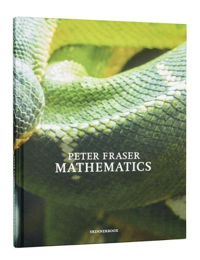
Peter Fraser visited our school to present to us his most recent work 'Mathematics'. 'Mathematics' is a photobook about the reality of the world through Fraser's eyes: Maths. Though there are scientific explanations to things, they all derive from mathematical thoughts and equations. So no matter what we encounter or what we do, we are constantly surrounded by maths; Fraser has been extremely interested in this thought even before he was a photographer. He produced the work over a period of 5 years starting from London and all the way to Istanbul. He used a very high definition camera to capture the intricate details of the world and just before pressing the shutter, calculated the position he was standing and distance between his subject and the camera. After heavy calculation and trusting his intuition, he pressed the shutter. I am very fascinated by his concept and I really like that he has chosen to travel all over the world and captured the amazing details to show the mathematical world we live in and it is interesting that he has presented concept through art/photography, it's as if by photographing it, he has captured this hidden concept that surrounds us everyday. I enjoyed that he has presented different ways of thinking about life and I think that will definitely carry out into my work.
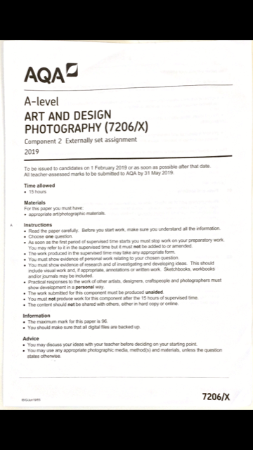
EXAM
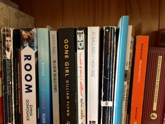
These are the options we got for our exam. I chose repetition as it is a style that I have never tried before and in component one, I had tried self portraiture which was also something I had never tried before too, so I thought it would be intriguing to carry on exploring styles of art I have not done. I also chose it because I wanted to explore the different ways in which repetition can be applied; one of the understanding is looking for the repetitive patterns in the things we capture. However, I want to use repetition to apply it to real life issues I am concerned about as they occur so much it is a repetition in itself. After choosing this theme, I went right to researching the given artists to get a sense of how repetition can be used and why it has been so wildly used by many different artists.
WHAT IS REPETITION AND IN WHAT WAYS REPETITION HAS BEEN USED IN PHOTOGRAPHY
Repetition, as described by the English dictionary, is the "the action of repeating something that has already been said or written or the recurrence of an action or event." I also researched author Tedric Garrison's essay (https://www.picturecorrect.com/tips/repetition-and-patterns-in-photography/) on repetition and have understood that Repetition can also be a tool for stability and order within the chaotic world as it is satisfying to know what to expect next. He explains, "Patterns are to photography what rhythm is to music. Without the limitation of just a single point of interest, repetition helps your eye dance from point to point with pure delight. You are not asked to make a judgment of the subject, simply to explore it. Like music, you are not expected to just listen to a single note, but to take in the high notes, low notes, the movements, and the beat. The goal here is not to just witness a good photograph but to experience it. Thus, when repetition is used correctly, it can greatly increase the emotional impact of your images".
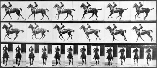
Repetition in photography has not only been used to capture the calming patterns in the world, but also used for scientific analysis. Photographer Eduard Muybridge wanted to see if horses and humans could fly. So, he set up trip wires whilst the horse and the person ran, capturing their every little move. With all the pictures capturing the subjects' moves, it created a collections of images that showed the process before, after and the exact moment the subject was in mid air. I think this is a very interesting way of using repetition as it has allows you to analyse the exact detail within a moment that is not clearly seen with the naked eye. Also, it forces you to concentrate on how you are taking the photos; detail and accuracy in the process of making a repetitive investigation is really important. For Muybridge it was figuring out how he would show the whole process with in advanced cameras of the 19th century.
PERSONAL CONTEXT
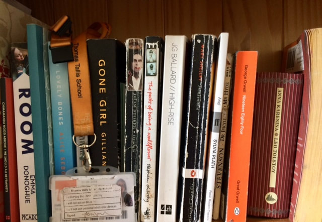

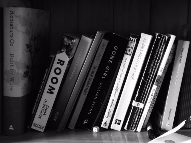
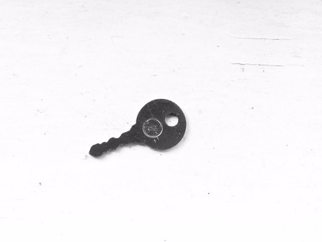
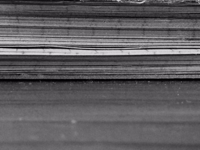
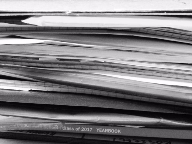
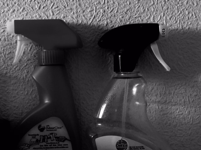
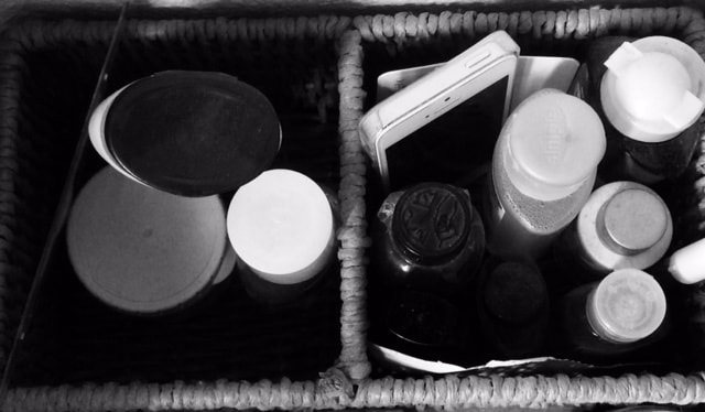
Photographers like Sol Lewitt has also shown that repetition can be used for personal investigation and curiosity. The mundane things we do everyday that we don't think about because it is so normal to us are repetition themselves. One of the things I do everyday without thinking about it is changing the placements of books in my bookstand or putting random objects in it. I decided to set a challenge for myself, where for 3 days I take images of something I have used regularly and capture it after; I took it in the same angle and position everyday so the changes are clear and I can view them objectively. I chose my bookcase as it is the thing I use the most and there are tiny small changes in it everyday as I put the books in random places or put other objects in it without thinking about it. This experiment has been interesting as I get to see the repetitive small changes I make everyday from my subconscious choices. Taking these up close really brings out the little details in the book case.
WIDER CONTEXT
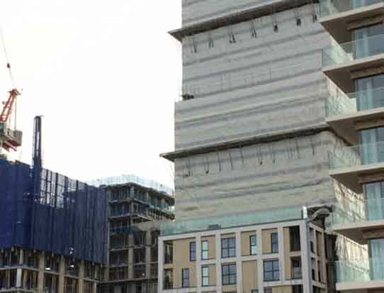
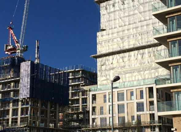
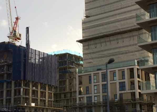
Finally, repetition can also be used for wider context. I took images of a construction site that I pass everyday from my travel to school. I chose to stand in the same position and take the image from the same angle so the changes (in this case it is the process of building a home) that happen are clear. This is more of a social and economic observe as these flats replaced a disinvested area of Kidbrooke and are now highly priced flats (gentrification). Watching the development of this has been interesting as everyday the gentrification of the area becomes a reality.
JOHN BALDESSARI
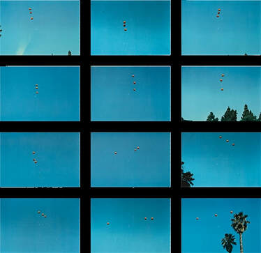
Baldessari is a conceptual artist based in California. He has worked with photography, film and video. His work 'Throwing Three Balls in the Air' presents his intrigue in language and games which structures are based on arbitrary and mandatory rules. Baldessari has always been interested in the connection of imagery and language to create meaning, often blurring the meaning in his work at the same time. In the work, he attempts at throwing three balls in the air to make a straight line, trying to the get the perfect result. Through tossing balls in the air and going through trial-and-error process to achieve his goal, Baldessari shows us that art can push boundaries, make you wonder, evoke emotions and still be 'art'. “Beauty is a by-product,” Baldessari explains in his interview with Seesaw Magazine, “Each time an artist does something, you get better and better at making beauty, so why work at it? Why not something else?” The aesthetic of the work itself is pleasing see as the orange balls compliments well with the blue sky, creating simplicity in a hectic process.
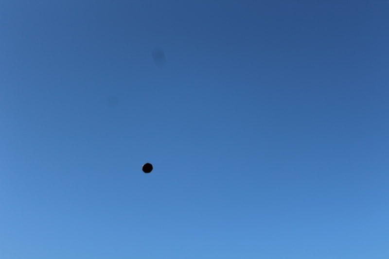
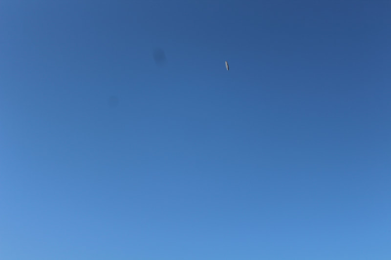
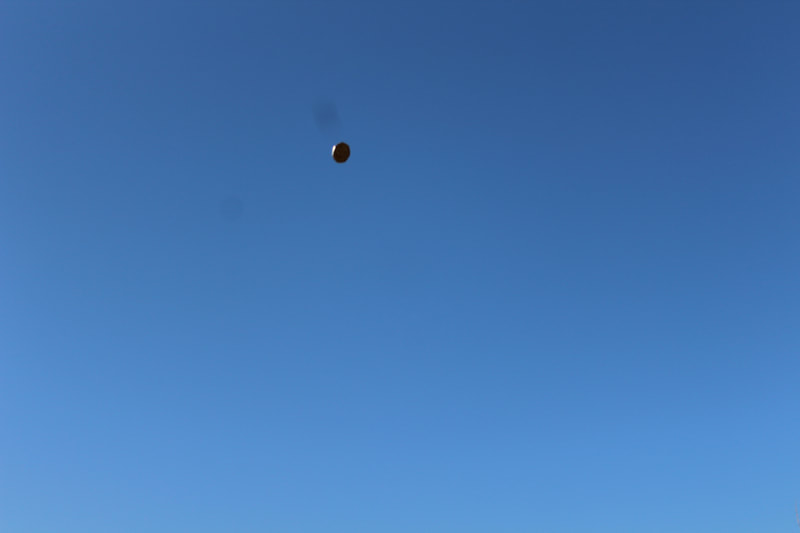
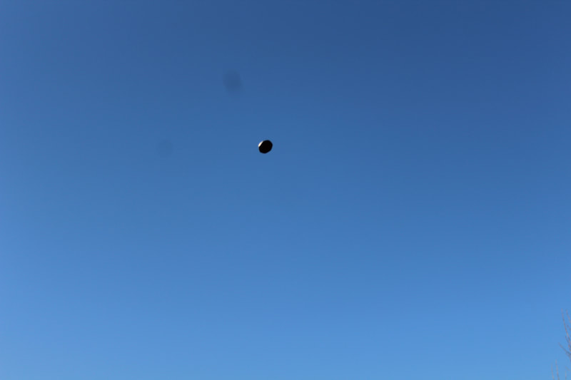
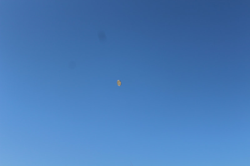
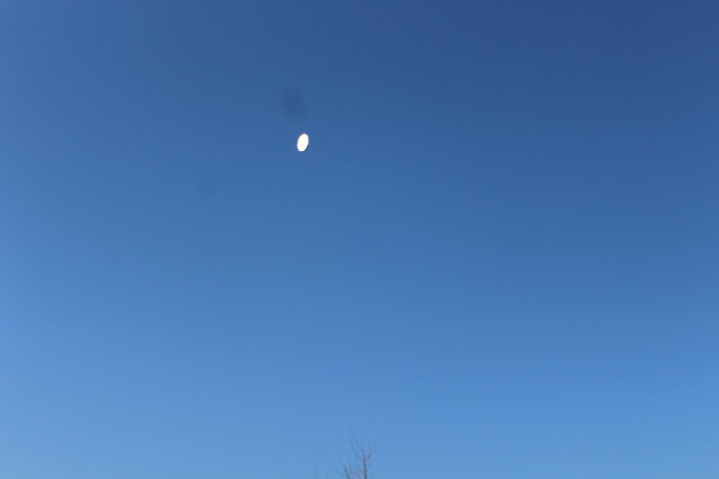
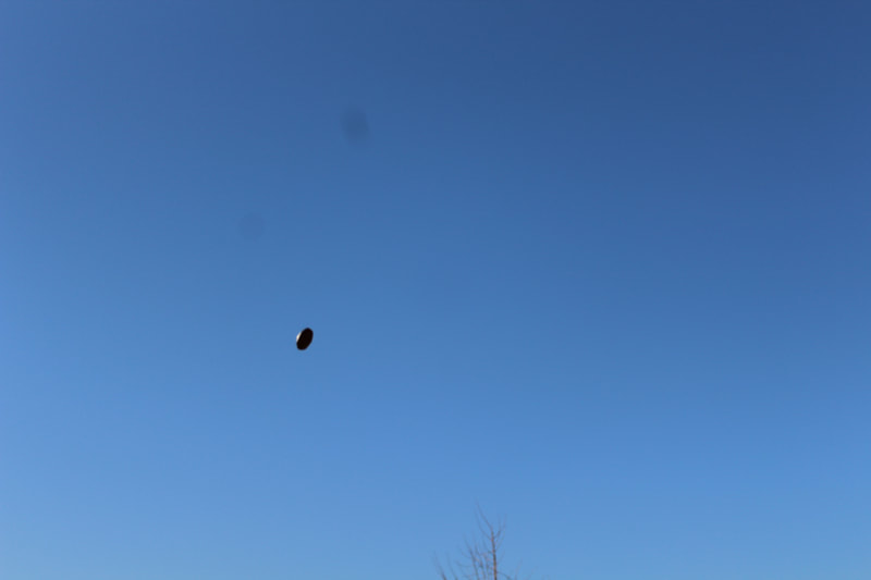
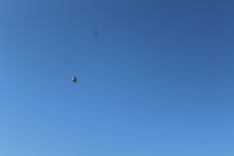
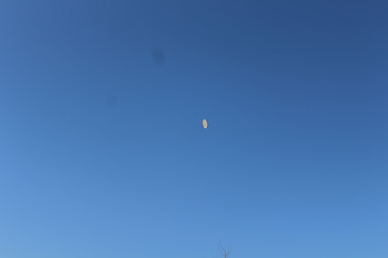
In my response, I used a coin to throw up in the air and photographed it whenever it reached mid air. Like Baldessari, I used a blue sky as a background as it makes it clear to the viewer the goal behind the work is to get the coin in midair and to show that art can make people strive for better. These are my best nine from the shoot and by actually doing this activity, I really understood Baldessari's concept of an artist trying to reach its goal through repetition. As he is a 20th century photographer, I can see the use of analysis of science still continues in the 20th century, however Baldessari switches a little bit by making an analysis on how an artist can reach its goal, instead of a scientific goal.
BERND AND HILLA BECHER
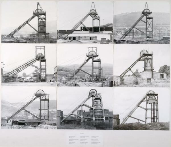
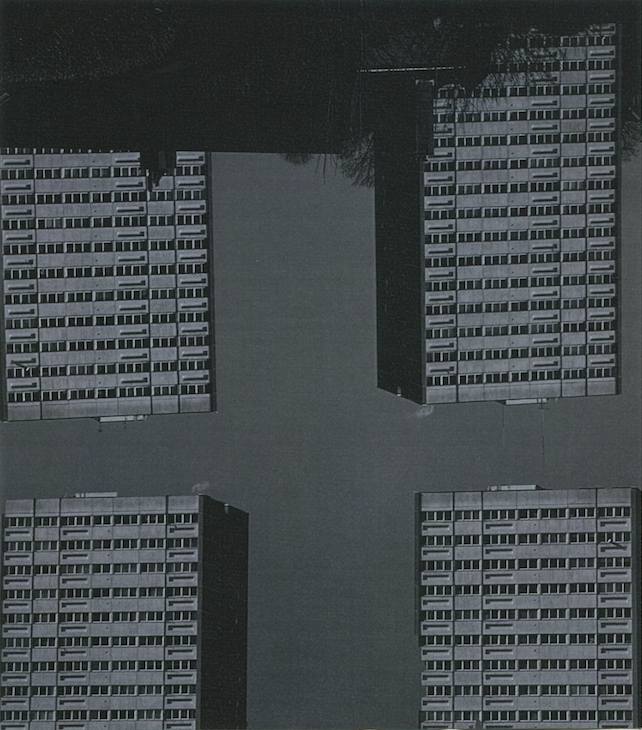
Bernd and Hilla Becher were a German duo that worked with conceptual photography. In the late 1950s, the duo photographed industrial workers such as water towers, blast furance, mine heads and etc. Their work is a response to the sentimental subjective photography which was coined by Otto Steinert and had become a very popular movement in Photography at the time. Bernd and Hilla's work roots back to the aesthetic of looking at things objectively and seeing them as "straight" which was the style pre WW1. Through taking several images of industrial works, the Bechers try to humanise the objects the show Nature's own cycle of the new taking over, destroying or devouring the new. By having the images in a sequence together, they want their viewer to be analytical and for them form the relationship between the images. Photographs "are not illustrations", the Bechers state.
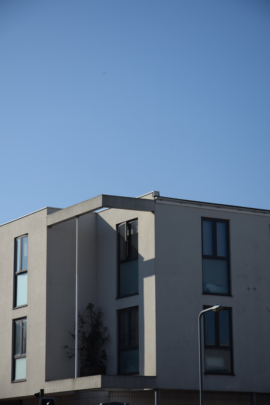
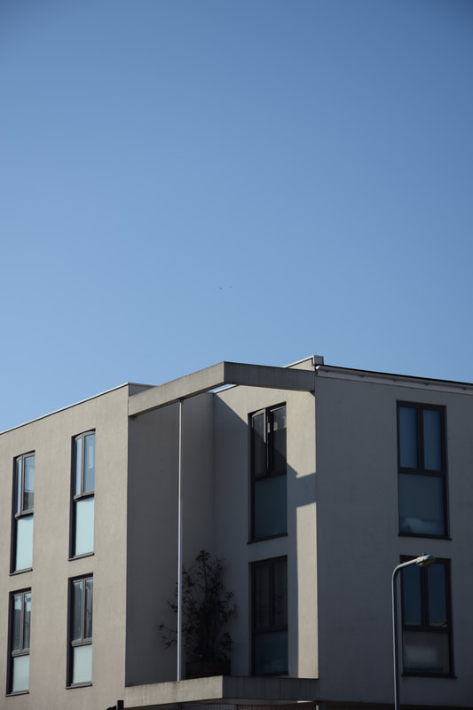
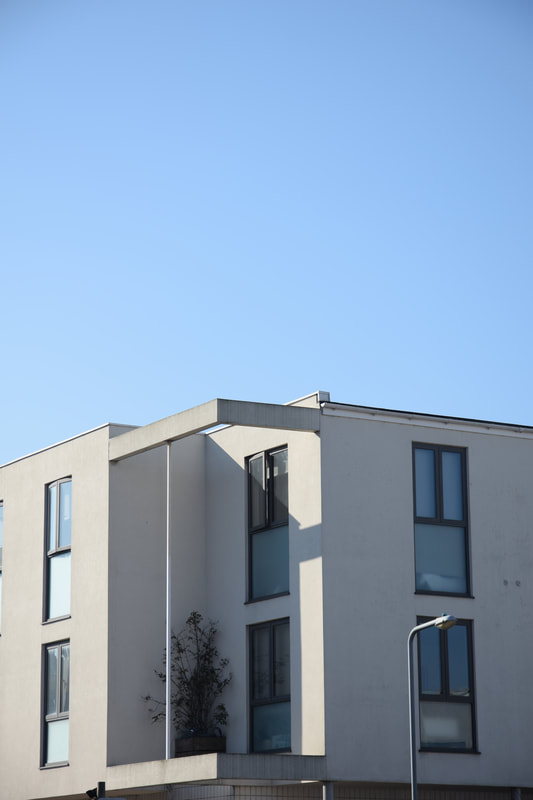
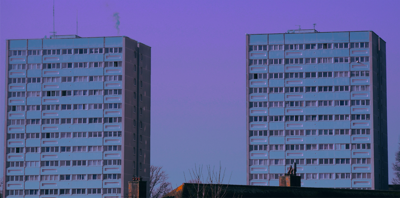
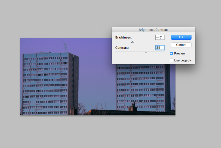
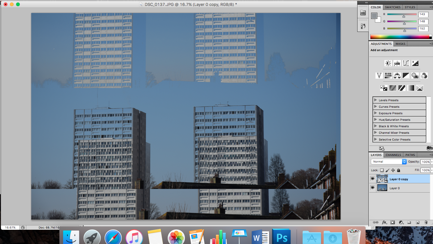
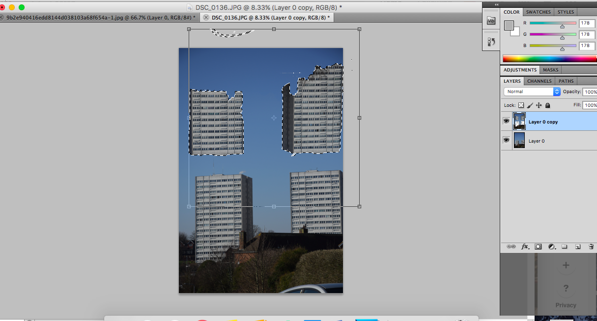
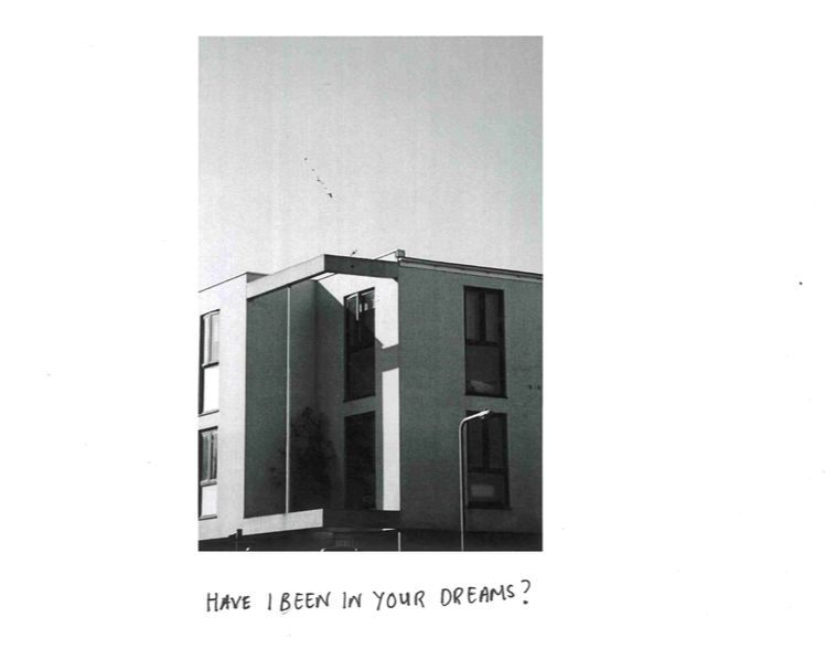
In my response, I took images of flats instead of construction sites as I liked the idea of looking at things objectively and "straight" as I feel like contemporary photography now has become more about subjectivity and going back to this genre of Photography was refreshing. Over a few days, I took the images of the same building and made sure that my angle, composition and where I was standing were all the same. I think the plain blue sky and the smooth matt-ness of the building helped contribute to seeing the place as objective as there is nothing to distract it. In this response I made sure I was accurate in my angles and composition so it would come out the same as before like Bernd and Hilla's work and so it can be as objective as possible. Although my images are not absolutely accurate, the images are still very similar to each other. Doing the same process over a period of time really made me understand the concept and be aware of a lot things I would not be usually if I was just taking a picture casually. The gallery setting on this website helped perfectly show the repetition and the relationship between the images like Bernd and Hilla's work. The relationship I showing in my response is the going back to the original objective way of looking at subjects in a modern world. However, I think next time I will actually put them in a grid set so the relationship is more clear.
SOL LEWITT
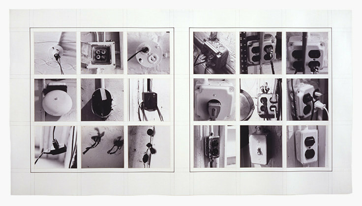
Conceptual artist Sol Lewitt took over 1000 images of mundane objects in his apartment in his work "Autobiography". His use of grids in this work is used to understand the relationship between the images he has taken, which is that the mundane objects shows the viewers who he as an artist, the mundane objects are hints of his identity. The book is quite intimate as it reveals his identity as an artist and a person too which he emphasises through the up-close shots of the objects, showing the details and the textures of the objects.
In my response, I took images of all the things that are in my room. Before pressing shutter, I looked for places that had repetition and patterns and took up close shots of it so the details and texture of the objects are focused on. Taking the images up close turned the mundane objects interesting and also created an intimate atmosphere as these mundane objects are a representation of me. Putting the images next to each other in grids cumulates them together and shows the relationship the images have with each other: revealing my identity. This has been a fun response as I got to capture the things that reveal who I am with just normal everyday objects.
In my response, I took images of all the things that are in my room. Before pressing shutter, I looked for places that had repetition and patterns and took up close shots of it so the details and texture of the objects are focused on. Taking the images up close turned the mundane objects interesting and also created an intimate atmosphere as these mundane objects are a representation of me. Putting the images next to each other in grids cumulates them together and shows the relationship the images have with each other: revealing my identity. This has been a fun response as I got to capture the things that reveal who I am with just normal everyday objects.
TYPOLOGY
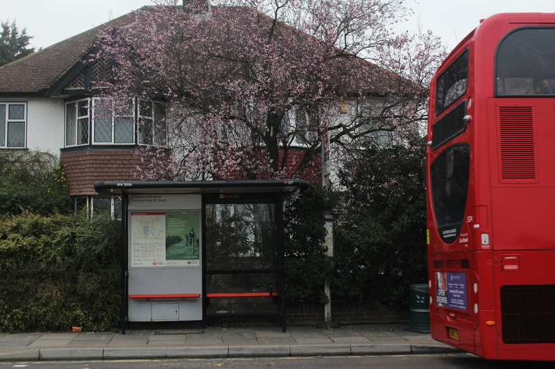
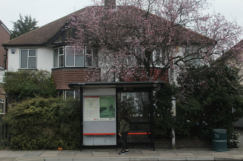
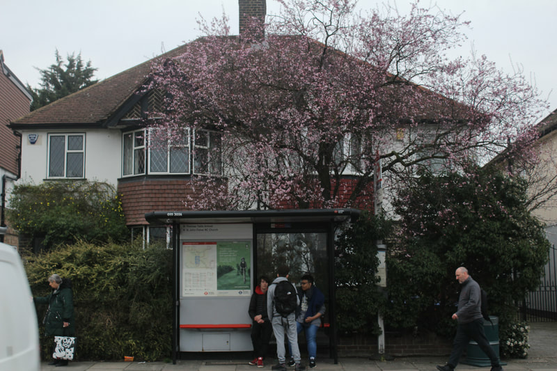
‘Typology’ was first used to describe a style of photography around the time Bernd and Hilla Becher began documenting German industrial architecture in 1959. Their work was stoic and detached and objective in the way they photographed the buildings. Their aim was to capture a record of a landscape they saw changing and disappearing, so Typologies became to not only record a moment in time, but to provoke the viewer to consider the subject’s place in the world. From then on, Typology has been wildly used to understand and analyse the way something has changed or the way it has remained. I created my own typology by taking several images of a bus stop I pass everyday to see the little changes that happen in such a still place that offers transportation. I took the images at the exact same time, same angle and position for a few days. What I found interesting was the subtle or big changes that happened, be it a bus passing by or a crowd of people. It was intriguing seeing the little changes that would happen to such a stoic and firm place.
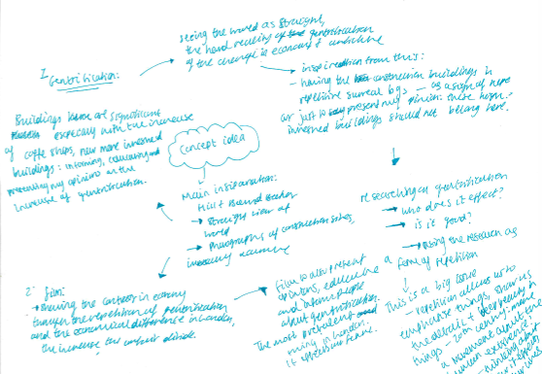
Now that I have understood the ways in which repetition has been used in photography, I have written a few ideas I could create from this and the mini projects I could do to develop my piece. From taking pictures of buildings, construction sites and putting them in grids to see the relationship between them, I have really become interested in the idea of gentrification (gentrification = "the process of renovating and improving a house or district so that it conforms to middle-class taste") and the social-economical issue of them being designed for the better, but still are oppressive economically and in terms of proximity as they are highly priced for such little space (for example, affluent inhabitants living at the top, while low income families living at the bottom). Another reason is that, repetition has been a way to understand the process of something or mini details that happen in the process; I want to use repetition of understanding the process of gentrification the ways in which it is oppressive. In my experiments, I also want to explore the relationships the future inhabitants will have with these gentrified buildings, the ways in which the gentrified buildings can be oppressive for people in terms of space and the architectual planning that goes into it, I want to explore how the gentrified buildings can occupy space that makes us feel threatened socially and economically.
Before heading into the theme of gentrification and experimenting with it, I did some research on how architecture and gentrification can be oppressive so I can be a good knowledge and can use this information for my experiments. I first researched how architecture can be made to be oppressive and I found this article: www.autodesk.com/redshift/design-for-social-justice/ which explained how architecutal designs can marginalise, like gentrification. They state that, "a blank concrete wall, transit that's out of reach, a skywalk that disengages the business class from the messy city below - each has a purpose that incorporates design as an accomplice [of marginalisation and gentrification]". This then applies to gentrification and it has become extremely repetitive as it has been increasing for years.
Before heading into the theme of gentrification and experimenting with it, I did some research on how architecture and gentrification can be oppressive so I can be a good knowledge and can use this information for my experiments. I first researched how architecture can be made to be oppressive and I found this article: www.autodesk.com/redshift/design-for-social-justice/ which explained how architecutal designs can marginalise, like gentrification. They state that, "a blank concrete wall, transit that's out of reach, a skywalk that disengages the business class from the messy city below - each has a purpose that incorporates design as an accomplice [of marginalisation and gentrification]". This then applies to gentrification and it has become extremely repetitive as it has been increasing for years.
EXPERIMENTS
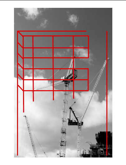
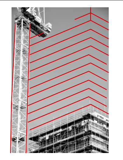
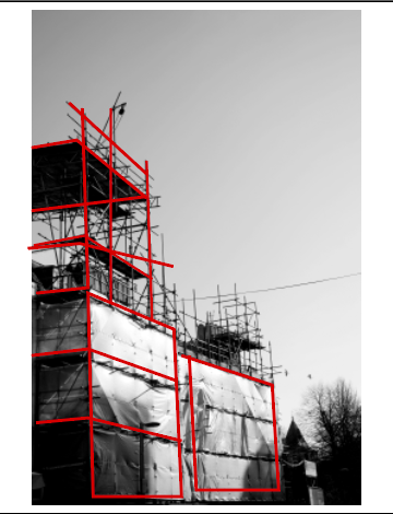
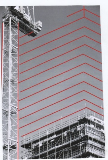
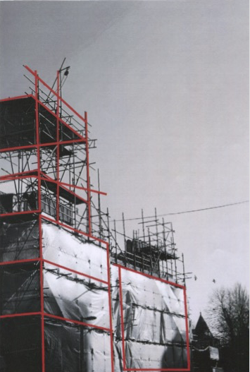
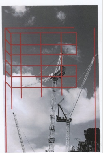
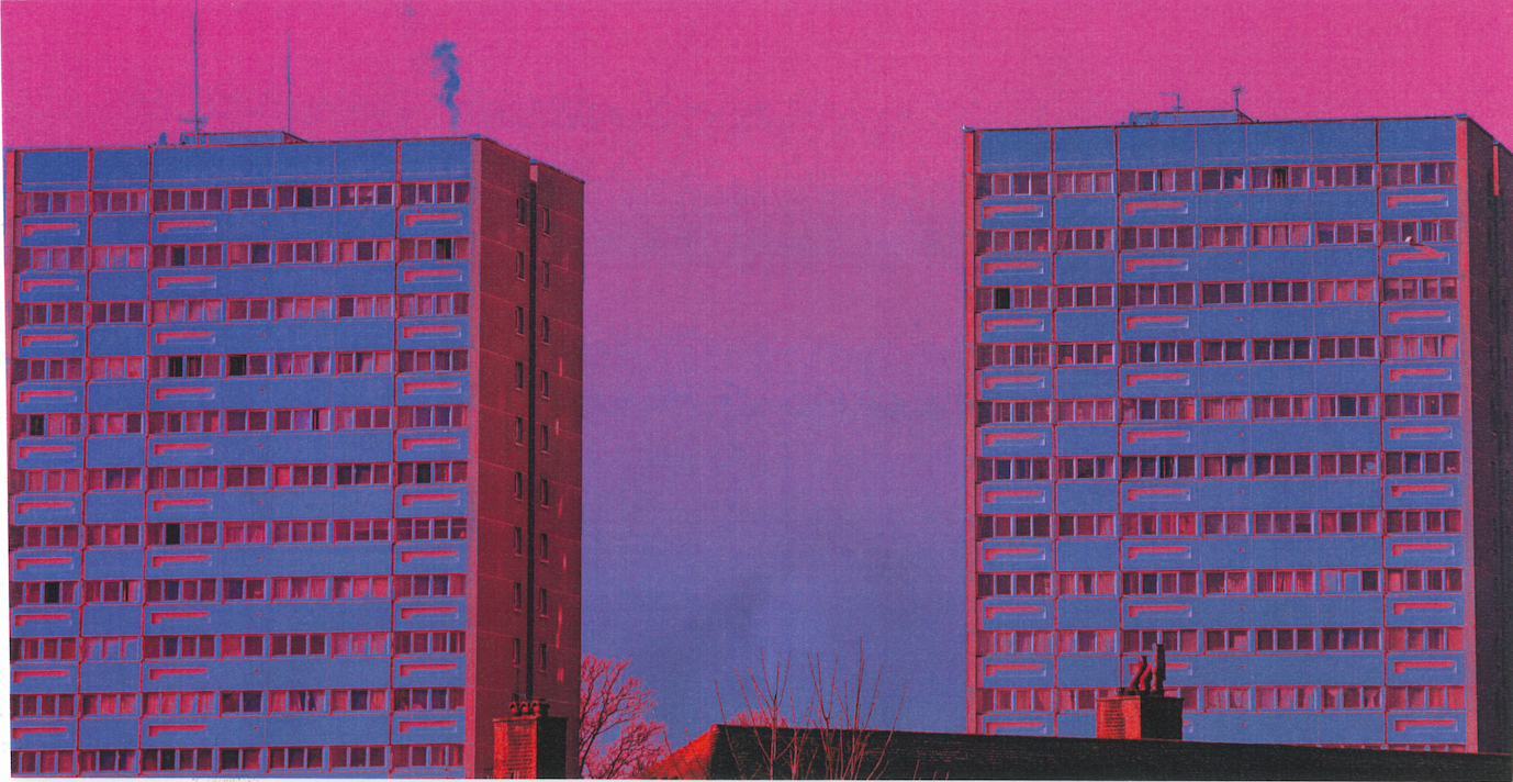
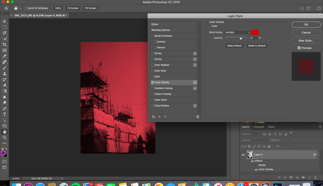
Contemporary artist Alexey Bogolepev captures old ruined Russian buildings from the Soviet era in his work 'BLOC'. The images are detached and taken objectively, similar to Bernd and Hilla Becher's work. His work is a common form of typology and through using red lines over the images of the buildings and creating a new building, he explores the symbolic layer of modernist architecture. He wondered "is a negative reading of Soviet buildings due to our traumatic historical memory, or are certain oppressive psychological instruments built into the actual designs?" He answers himself by saying, "majority of architectural projects were realised differently from their original drafts". His wondering of what makes a building an oppressive building, whether it is the memories we make of them or it is the intentions of the architect, makes me wonder about how these gentrified buildings are designed - are they are intentionally made to be economically oppressive by the architect (e.g Grenfell Tower) I was intrigued by this idea so, I explored this through the use of the red lines from Bogolepev's work. I used them (using Illustrator) to create a sort of blue print of what the new gentrified buildings would look like by using the cranes and the structure of the construction site as a guide line. This would show the making of an economical and psychologically oppressive buildings. I purposefully left the red lines unfinished and had them in wonky positions to emphasise the sense of planning of the gentrified buildings. I also scanned the images to give a sense of something remaining, which is gentrification here. However, I think the digital versions show this well to as they are fresh and the quality is clear. What I would have done differently next time is experimented more with the layers of the building.
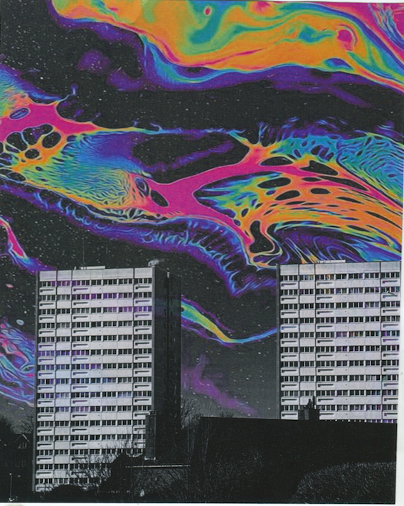
Bogolepev's work also prompted me to experiment with these gentrified buildings in an apocalyptic/futuristic style. I first used a very abstract image and made it the background of the building. I like the abstractness and saturation of the image as I feel it alienates the buildings from reality. I also wanted to create this sense of alienation by highly saturating the colours of the building and also duplicating them. I then scanned these images as I felt would add to the surreal-ness. My favourite one is the second experiment one as I think the vibrance really helps create an apocalyptic style, which is almost like the rapid increase of gentrification in our society. I increased the saturation and vibrance from the first try as I felt it was too mundane and realistic. However, at the end I felt this experiment was not successful as I felt it was more visually pleasing rather than it being a work that makes viewers think about what it is that I am trying to explore about gentrification through the use of repetition.
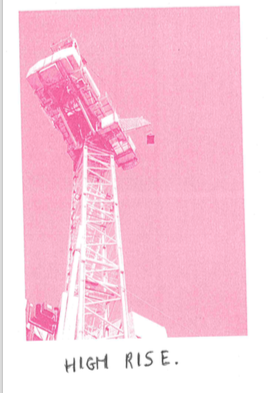
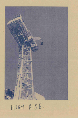
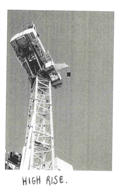
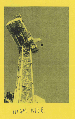
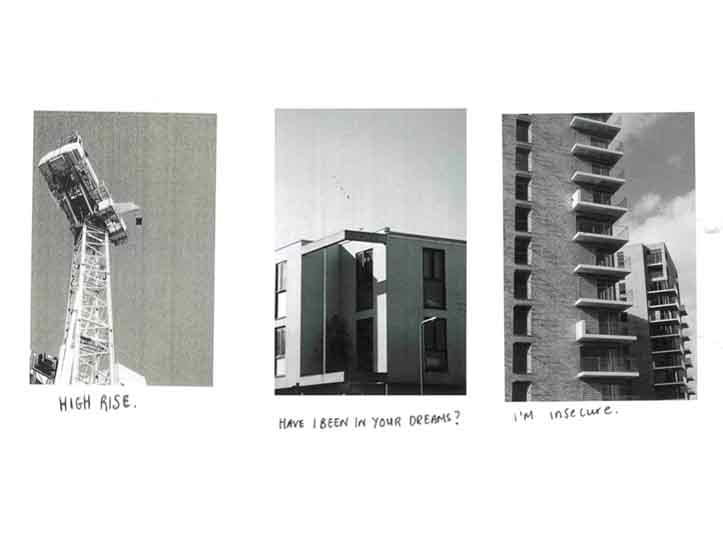
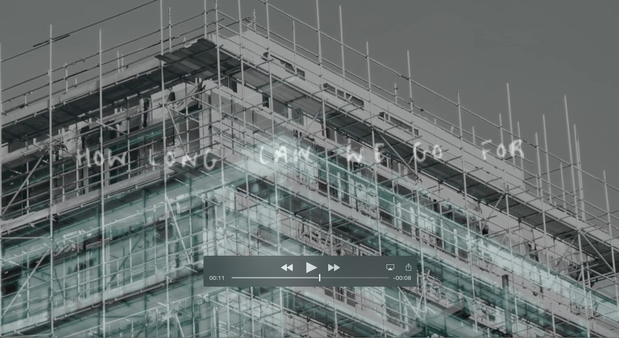
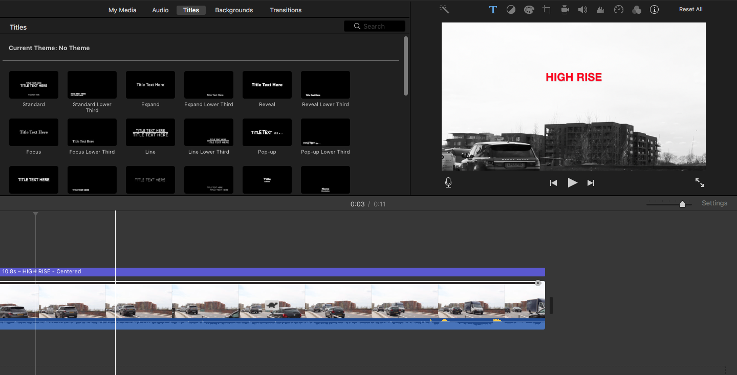
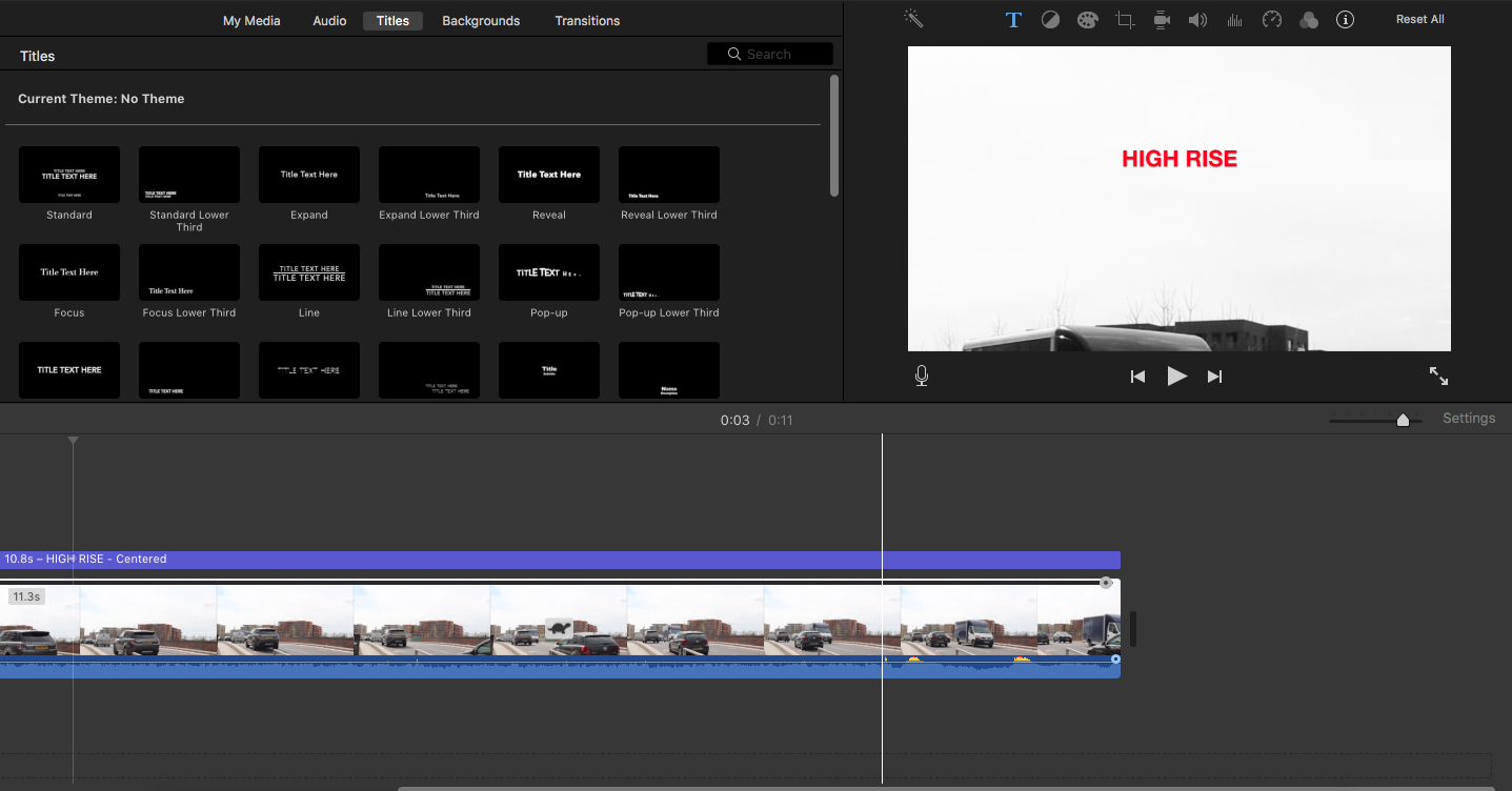
In this experiment, I explored the relationships the future inhabitants will have with these gentrified buildings inspired by John Baldessari's 'Goya series' which depicts a repeated dialogue between imagery and text. This work is contextualises mundane objects, commenting on the human condition and humanity's values; it is humorous as well as cynical which is what really intrigued me. I wanted to use the satire from his work to represent the relationship between the gentrified buildings and the people who will live in it. In this first experiment, I changed the image into black and white, and then printed it out small so there would be a white boarder around it. I labelled the first one of a crane 'High Rise' as a reference to the book and the structure of the build of the architecure. By using a picture of a crane, it foreshadows where the new inhabitants will be living in, hence 'high rise'. I also printed these in different coloured paper to experiment with as the vibrance of the colour added to the satire as it is such a serious topic. In my next few experiments, I wanted to make the relationship between the buildings and the future inhabitants stand out so I used texts that would be said in an actual relationship. I wanted to show the instability of these gentrified buildings and the longing for a suitable living space that is not gentrified. I then put them together to create a whole repetitive dialogue. I enjoyed this experiment as it combined text and imagery to create a satiric piece of work through repetition. I definitely I will carry on using imagery and text in my other experiments for repetition as I feel text adds a new depth to repetition.
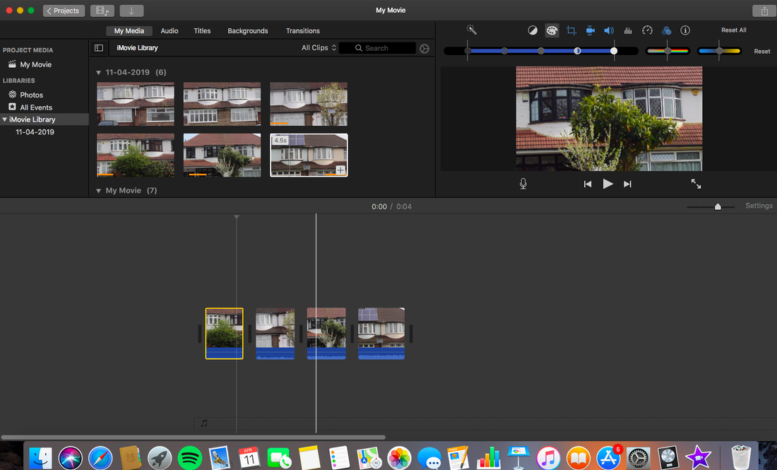
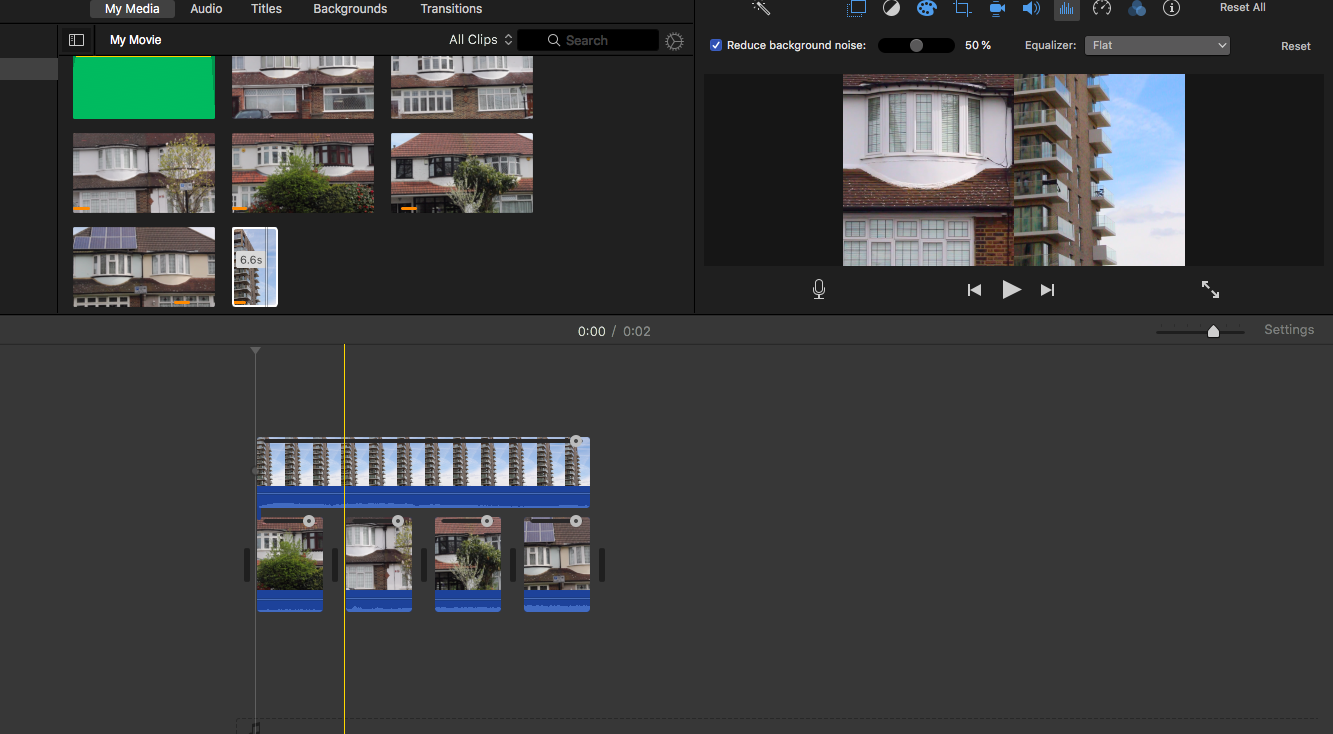
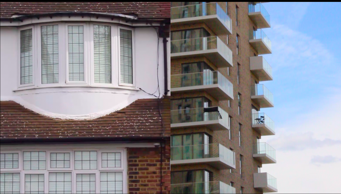
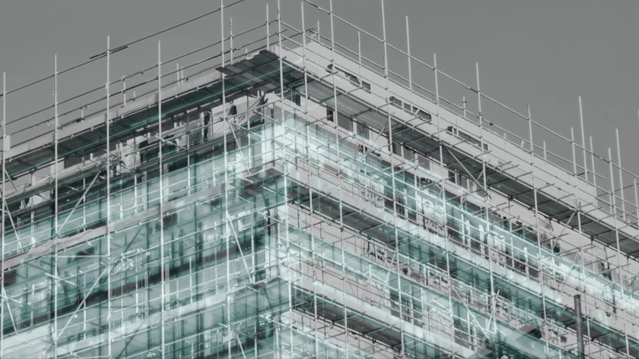
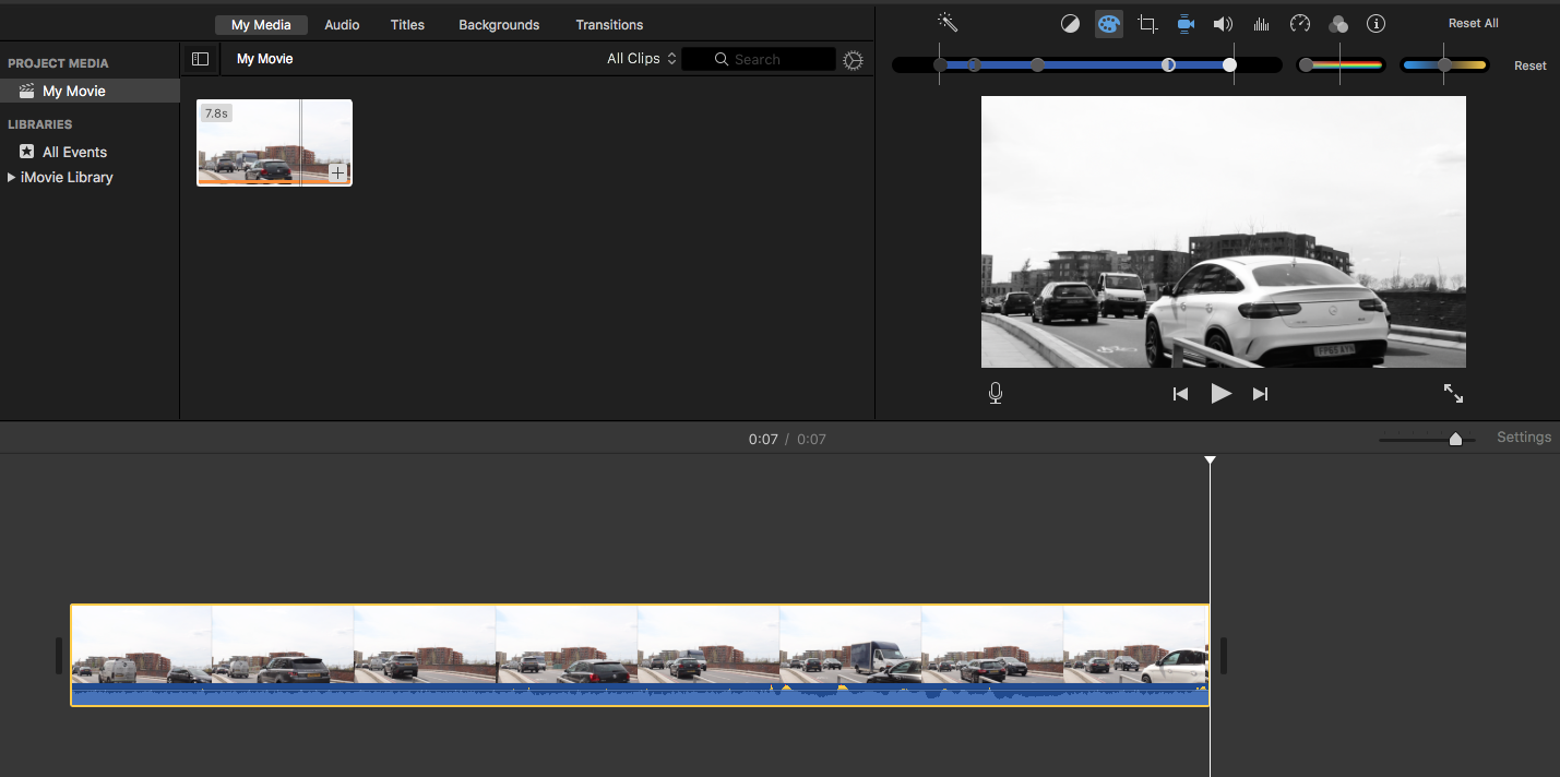
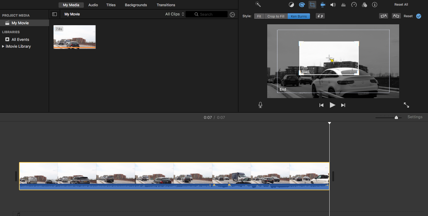
Next, I wanted to re-try my response to Bernd and hills Becher's work, but this time using videography. I chose my subject to be suburban houses around the area and videoed them the same way I did for my response: the same position, angle and composition. However, this was harder than I thought as my hands were shaky and videoing "straight" like the Hills Becher's was very important here as it is an observation on the suburban houses to make a comparison to the gentrified flats. To make this more successful, I will use a tripod next time. I then went onto iMovie and put them into consecutive order. I left it at this as this as it was looking at them objectively and adding any other editing style would have made subjective instead and also, I wanted to show the repetitiveness in the architecture of the houses. I then wanted to show a contrast between the houses and flats, so I made a diptych style video in which a video of the flats was positioned next to the videos of the houses. Having them next to each other really highlights the differences between them like the difference in the way they have been built, the way the plants have lively plants next to them and the flats are bare and have dull neutral colours while the houses have brighter colours. I kept this in colour as I wanted to reflect real life and also to highlight the differences between them and it reinforces the act looking at the buildings as "straight" and objectively.
|
High Rise overlay from Thomas Tallis School on Vimeo. |
|
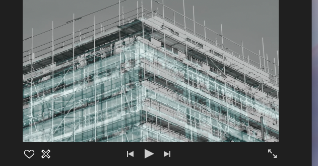
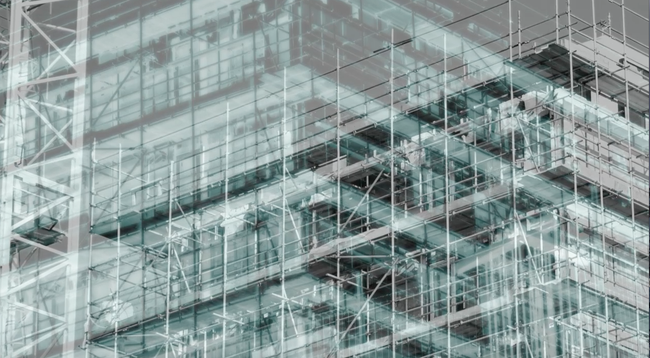
My last experiment allowed me to explore more ways in which I can use videography to present this theme. Here, I explored the ways in which the gentrified buildings can be oppressive in its proximity and the space it occupies as it replaces the disinvested areas in which low income families lived for affluent buyers. A lot of these gentrified buildings are extremely tall and when we look at it from below, it can be extremely intimidating and threatening. In this experiment, I used an image of a construction site and I used the pan tool in iMovie so it would imitate the threatening feeling of looking up at a tall building from below. I then layered this with the same image and made the first layer black and white and the second image inverted, so when when they overlap through the panning, it looks like as if the two are moving into each other. When they move into each other, it looks like the finished building as the inverted layer looks like glass over the structure of the building. I then put words from my last experiment over the layered panned images as I wanted to reinforce the relationship between the future inhabitants as they are the people who look attracted to the buildings the most.
|
High Rise test from Thomas Tallis School on Vimeo. |
|
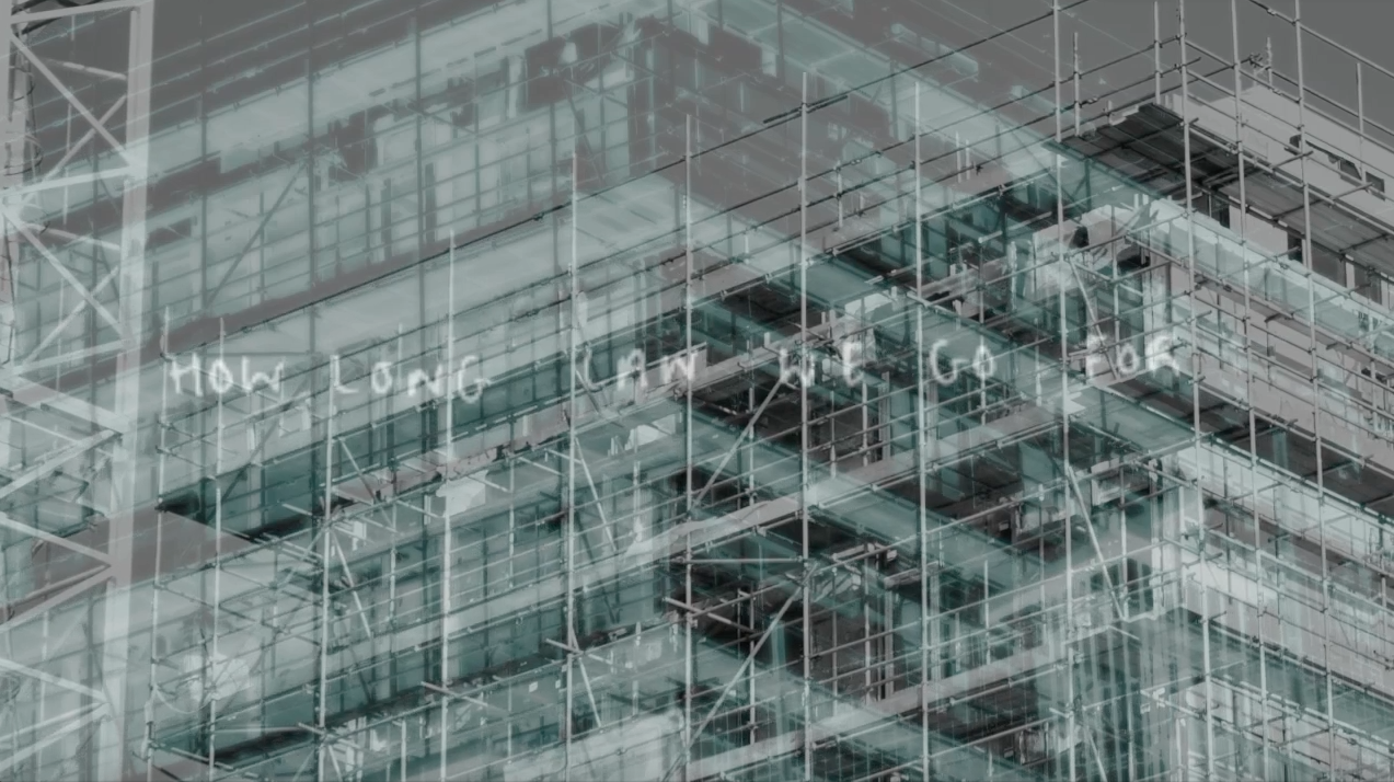
From my last experiment, I decided to not have handwritten words on the videos as I felt my handwriting didn't show a sense of urgency and need of awareness of the social and economical change happening. Instead, I chose to have the words in Helvetica font and in red as this is not only eye grabbing, but the sharpness of the font along with the vibrance of the red creates that sense of danger (in this case it is social and economical danger). Having the video in black and white adds simplicity and makes the words stand out which draws the viewer to think more about the reason and context behind this rather than being distracted by the colour in the video. While editing this video, I chose to have it zoom into the sky and keeping the 'High Rise' words remain as this acts as a foreshadow of the increase of extremely tall gentrified buildings.
My last video had an audio error which instead of keeping it mute, it made me think of ways I could use audio/sound to enhance my idea. In the videos I shot of construction sites and buildings, there were always sounds of cars, hammers and things being moved mechanically and these sounds intrigued me as it shows repetitive a process of gentrification and it also brings a sense of reality as they are continuously going on. This inspired me to not only put the sounds of the buildings being made, but also sounds that are connotations or in a way opposite to gentrification, such as community as gentrification creates a divide in the community and home. Here, one of the audios I have recorded is of a classroom conversation to present the theme of 'community' as it is always filled with conversations and activities. I think the multiple combination of different noises is perfect as it acts as a contrast to the word High Rise and it's association as it connotes to being separate and afar, which is what gentrification does to society. The only thing I would change is the volume; in here it is too loud and that can be distracting, so next time I would lower it so it is not overtaking the video. If I had a better software, I would not have the words fade in or out of the video as it would enhance the quality off my work.
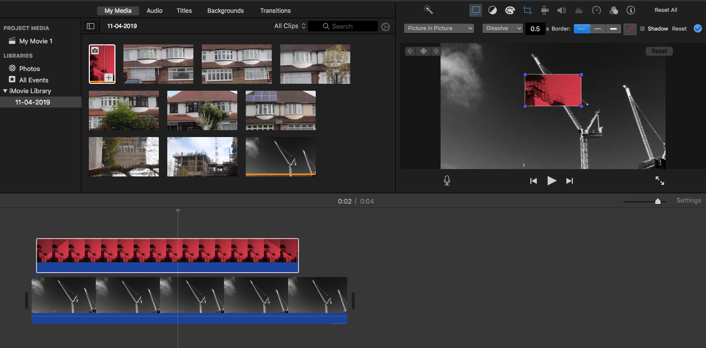
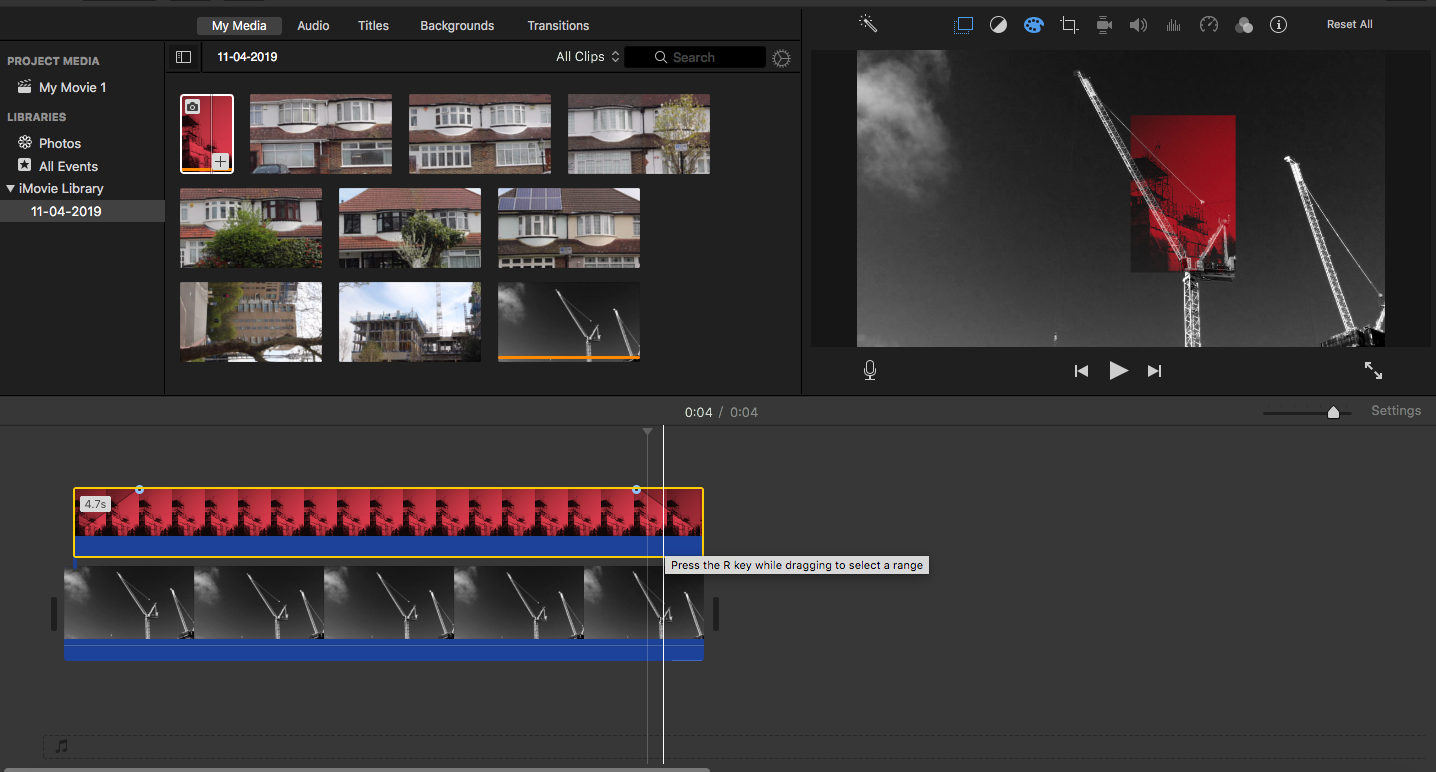
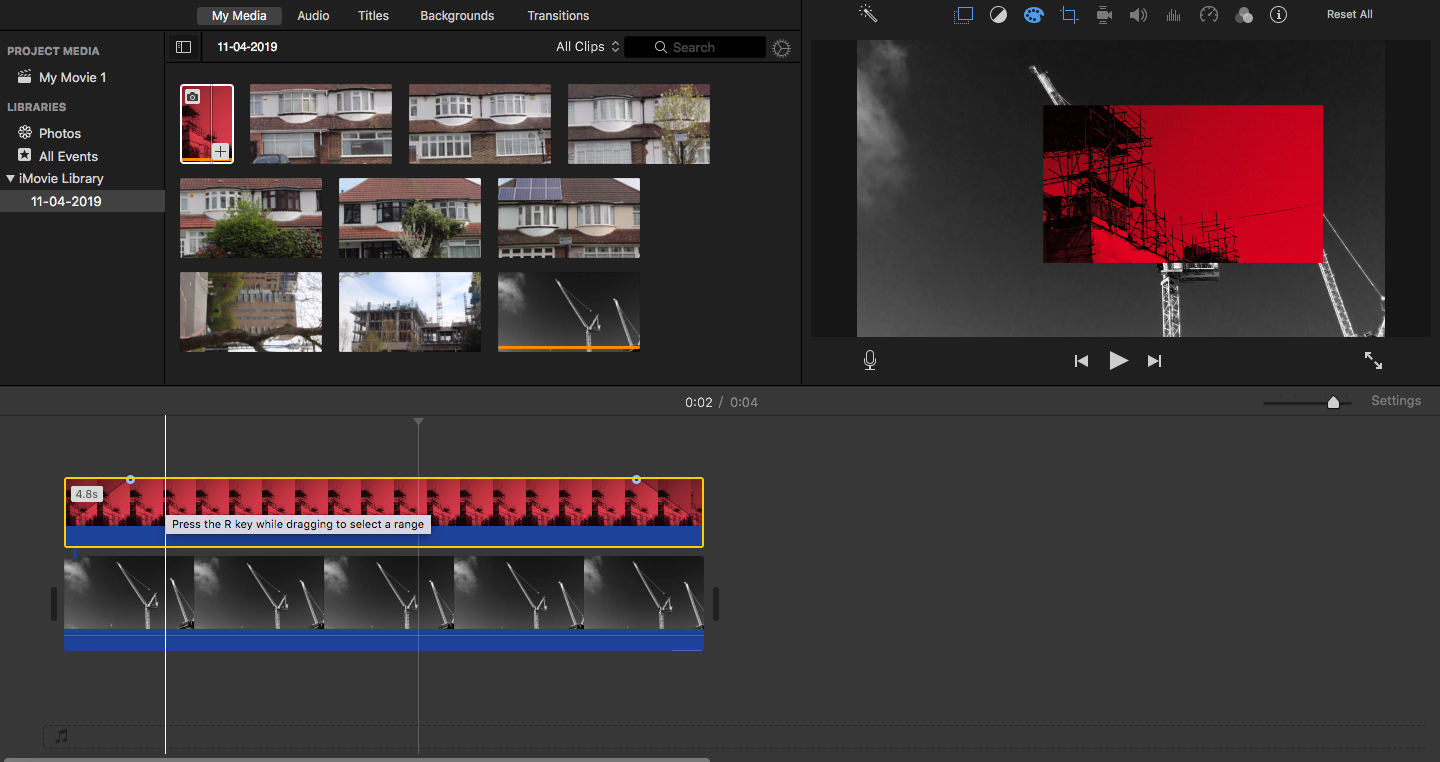
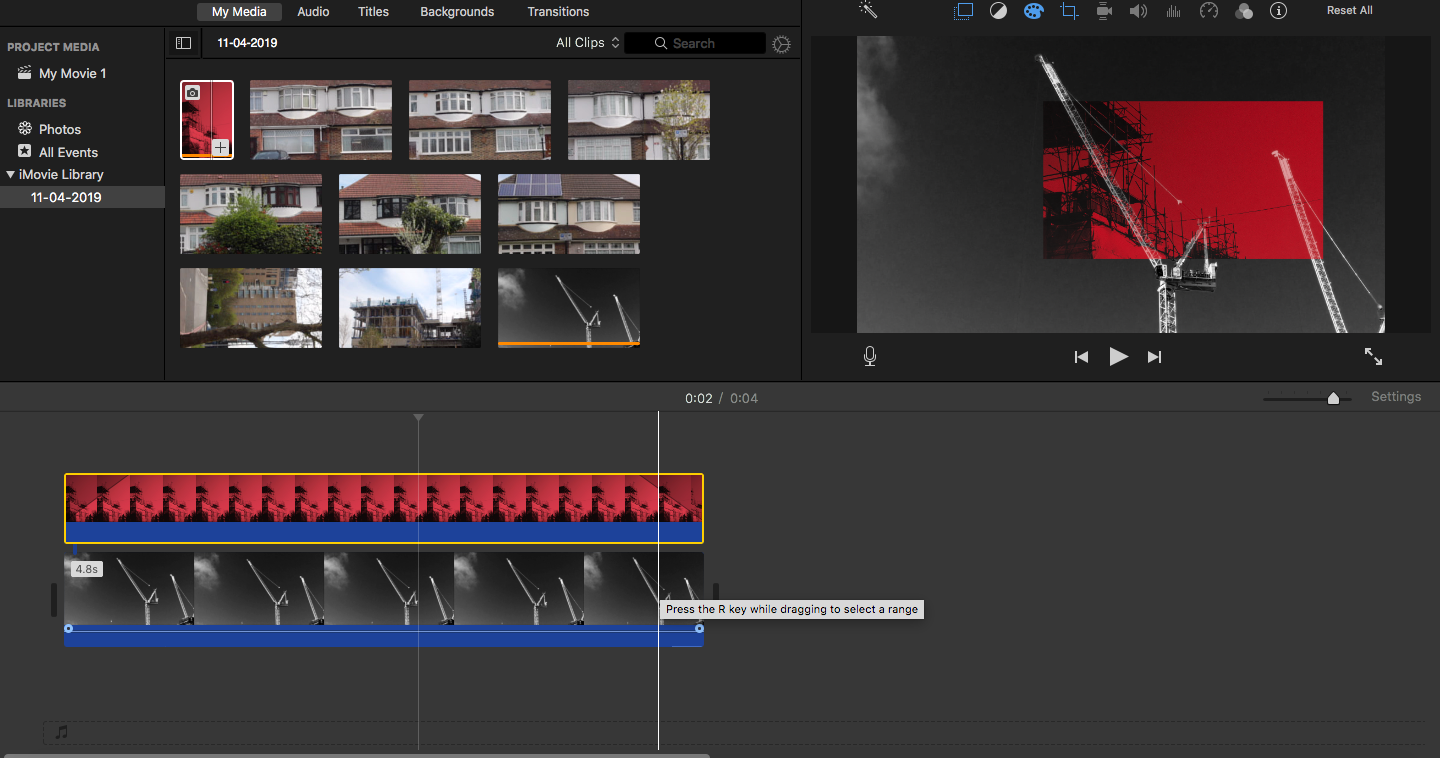
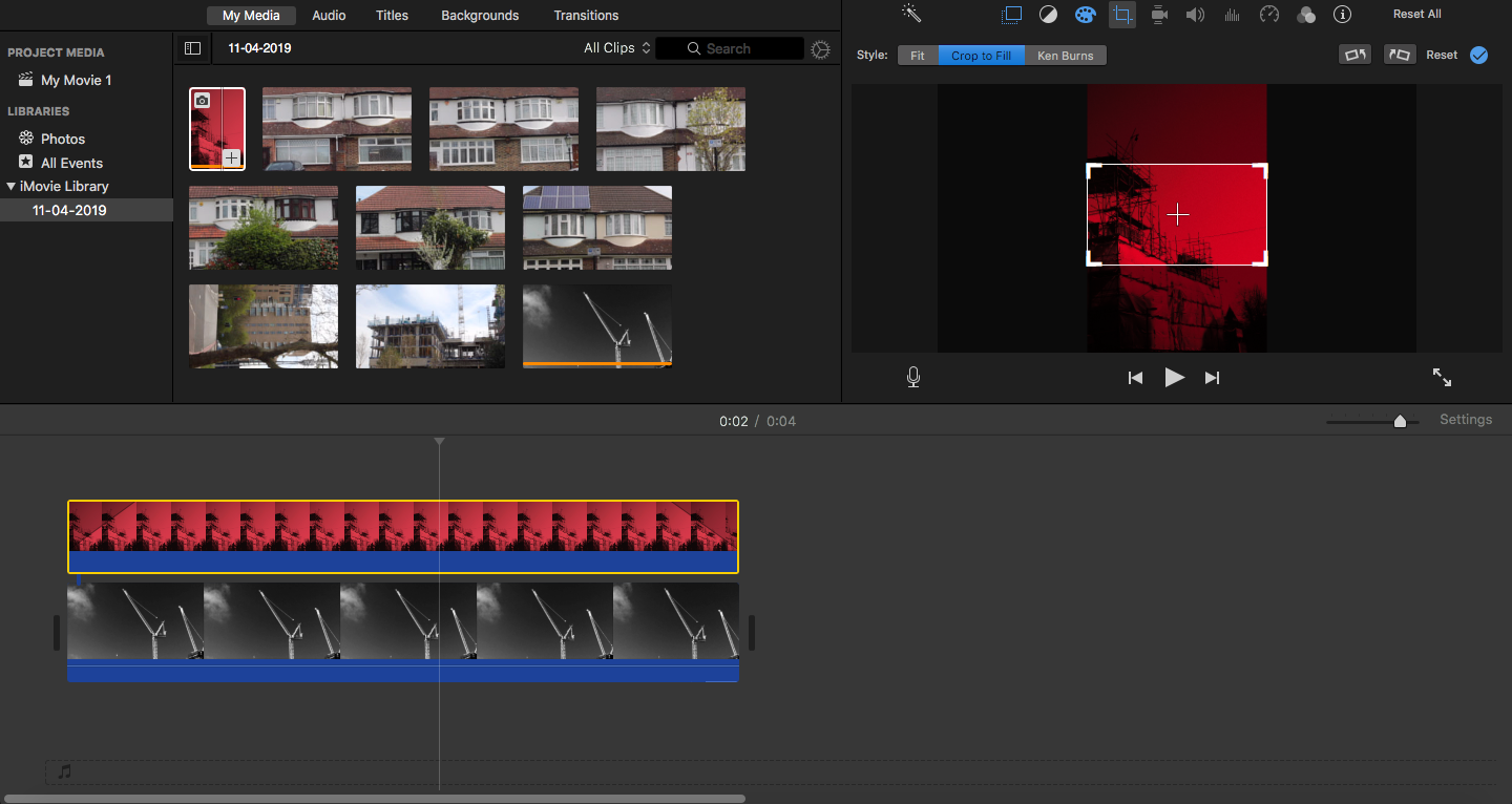
I wanted to experiment with layering images and videography as a way to show the rapid progress of the gentrification and the way it is increasing. On photoshop, I changed the colour layer of the image so it would be filled with red and then layered that on top of a video of a crane and centred it in the middle so it shows what the cranes turn into next which is a building being constructed. The red again is used to symbolise the rapid progress with gentrification and by placing it exactly where the cranes are, this emphasises the progress more. This has been an interesting experiment as it mixes two medias together and it it adds more depth to my work and this will definitely be something I add into my final work. However, if I had a better software, I would also not have the picture fade in or out of the video as it looks tacky and by having it not fade, it would emphasise permanence of the rapid progress of gentrification.
In my final work, I plan to have two separate laptops where one laptop plays videos I have edited of construction sites and gentrified buildings, while on the other words are words that relate to the theme of gentrification and class such as frequent use of 'High Rise'. I will have this in a long loop of about 5 minutes it can be explorative of my narrative of gentrification. With the words beside the videos, I want people to understand the rapid and dangerous progress of gentrification by using words that directly speak to the viewer, making the viewer the victim of gentrification. This was inspired by the artists Bruce Nauman's work 'Good Boy, Bad Boy'. His work consists of videos of two people, one is a black man only seen from his head to shoulder and the other is a white woman. They both say the same lines in neutral tones and each time they say it, their rhythm gets faster and they start to get angry and this is on a continuous loop. By juxtaposing a white woman and a Blackman in his video installation, he presents the topic of gender and race, and as a whole identity and having this in a loop, the viewer is immersed into the relationship between gender and identity just from the words they speak and how they appear. Here is how I plan to do this in my 15 hours:
1st day:
- experimenting with style and presentation of videos for one video side of the two screens that it will be presented on
- creating words that show a relationship between the videos and words that direct the viewer too
- creating a story board for both them so they loop together and are in the same sequence
- putting in sounds for the words
2nd day:
- putting the whole sequence together, finalising it
- playing it two different laptops to see if it is successful
3rd day:
- final check on the sequence and it playing on two different screens
- displaying it on different places; empty room, crowded room, outside
- slide show: documenting and evaluating
