JUXTAPOSITION.
My exhibition is all about juxtaposition. I chose some images that I have taken before. Some of these are different types of photography e.g Double exposure and conceptual photography and I think they can all go under the theme 'Identity'. With these images I put them in places I think that juxtapose that image.
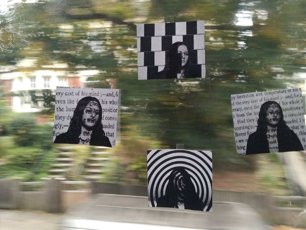
For the first one, I took put the image on bus's window while it was driving around. I like this because I like how the colourful trees contrast with the white and blacks in the images and how, in the background it's a blur but in the images, it's just one person staying still. However, I think I should've stuck on simpler images, by doing this I think the contrast will be more clear. This passenger who saw my work said he thinks that the trees are a bit too colourful for the dark images, if I put the images on something darker, the whites parts of the image will be highlighted more.
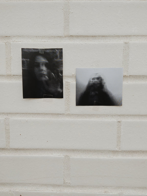
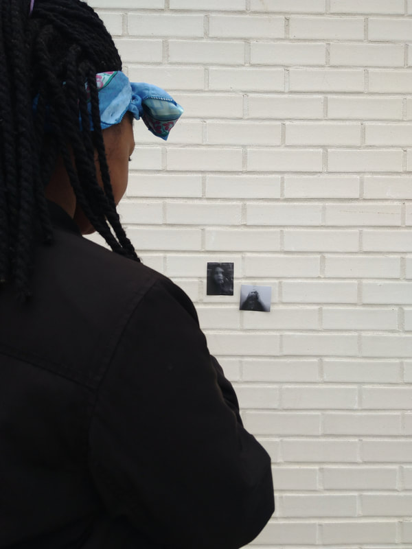
The second image is my favourite one because everything just contrasts well. However my viewers thought differently; some said it quite spooky and they liked the difference between the images and the wall, others said the background is too white and maybe would've looked better on the marbel and another person said they liked the blurry images and it looked a little 'spectral' which is what I was trying to go for.
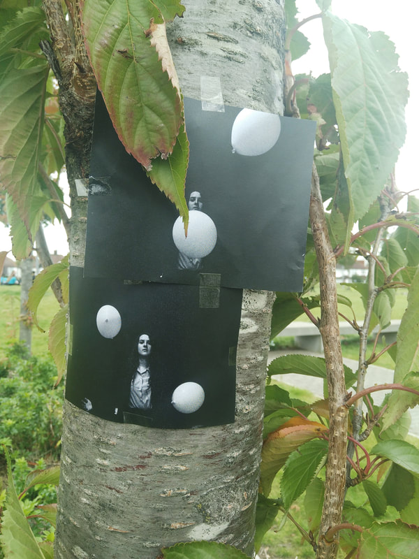
The third image is inspired by the photographer Kyle Thompson, in his images he is in a river surrounded by red balloons. The balloons represent love for him, in my picture they represent peace and purity and the person who is in the dark is trying to find peace but they can't. So with this image, I stuck it on a tree. I think the bright colours on this one contrast well and I like that the leaves kind of cover the image, it's like I'm trying to hide something.
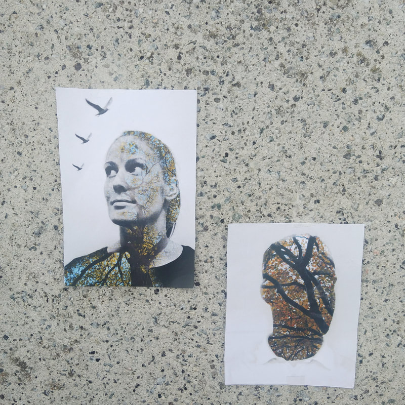
The fourth image is my least favourite because there juxtaposition (the marble and the natural double exposure imagery) isn't quite clear. One viewer thought that the marble background pushed it a little too far but said that the speckles from the marble compliments the double exposure images.
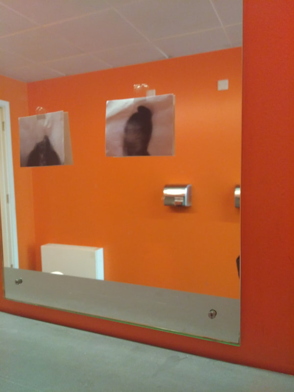
The last image is also another one I don't particularly like because the tape and the creases makes it look a little inadequate. One the viewers said that the orange background is a little too bright for something ghostly. Another viewer said that they liked the contrast between the mirror and the pictures, the pictures being blurry and the mirror is the opposite of that, which is what I was going for.
Overall this has been an interesting project and it has been interesting to see what others think of my work.
For the first one, I took put the image on bus's window while it was driving around. I like this because I like how the colourful trees contrast with the white and blacks in the images and how, in the background it's a blur but in the images, it's just one person staying still. However, I think I should've stuck on simpler images, by doing this I think the contrast will be more clear. This passenger who saw my work said he thinks that the trees are a bit too colourful for the dark images, if I put the images on something darker, the whites parts of the image will be highlighted more.
The second image is my favourite one because everything just contrasts well. However my viewers thought differently; some said it quite spooky and they liked the difference between the images and the wall, others said the background is too white and maybe would've looked better on the marbel and another person said they liked the blurry images and it looked a little 'spectral' which is what I was trying to go for.
The third image is inspired by the photographer Kyle Thompson, in his images he is in a river surrounded by red balloons. The balloons represent love for him, in my picture they represent peace and purity and the person who is in the dark is trying to find peace but they can't. So with this image, I stuck it on a tree. I think the bright colours on this one contrast well and I like that the leaves kind of cover the image, it's like I'm trying to hide something.
The fourth image is my least favourite because there juxtaposition (the marble and the natural double exposure imagery) isn't quite clear. One viewer thought that the marble background pushed it a little too far but said that the speckles from the marble compliments the double exposure images.
The last image is also another one I don't particularly like because the tape and the creases makes it look a little inadequate. One the viewers said that the orange background is a little too bright for something ghostly. Another viewer said that they liked the contrast between the mirror and the pictures, the pictures being blurry and the mirror is the opposite of that, which is what I was going for.
Overall this has been an interesting project and it has been interesting to see what others think of my work.