ALBERT RENGER - PATZSCH
Albert Renger Patzsch was a German photographer. His photography links to the 'Neue Sachlichkeit' (New Objectivity) movement and the aim of this movement was to appreciate life as it is and document its beauty. This movement was made because many people had started think that the world is very brutal and cruel due Germany losing two wars and having to deal with the aftereffects of that alone. Before WW1, Art and Photography heavily focused on idealism and showing false images of the world.
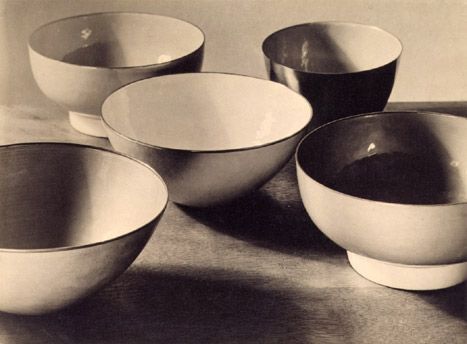
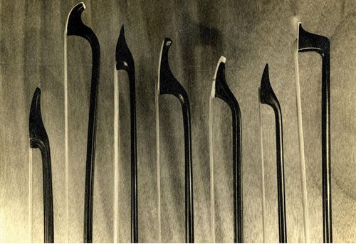
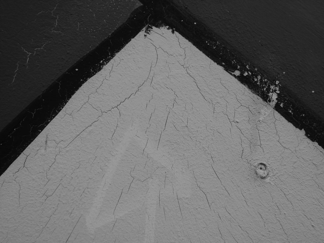
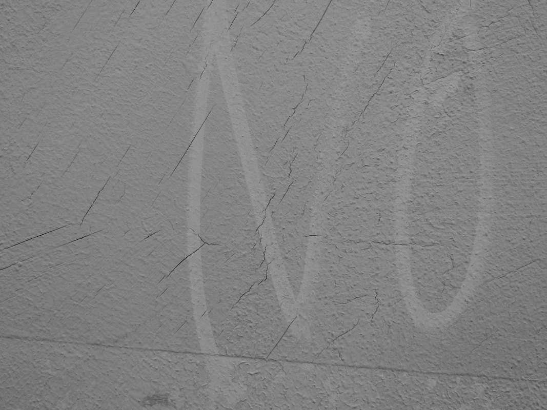
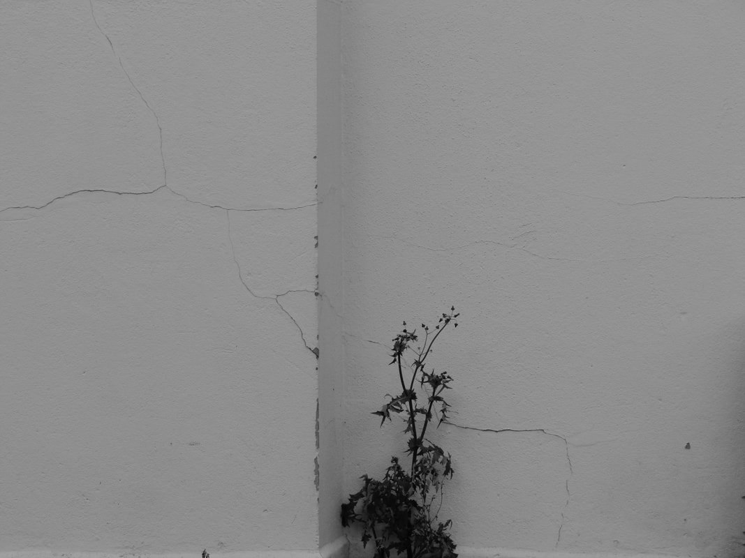
In Patzsch's photography, he zooms into mundane objects and isolates it so we as viewer's are not distracted by anything around it, our focus is to be solely on the object he has photographed. Patzsch does this so we can see the details and the beauty it has. Many of his work has repetition or patterns to catch the viewers attention and to, again, show that mundane and normal objects such as irons or stairs are interesting, beautiful and we should appreciate it while it is around. Also, I think the black and white filter really bring out details of the subject, things we wouldn't normally notice if it was in colour.
In Patzsch's photography, he zooms into mundane objects and isolates it so we as viewer's are not distracted by anything around it, our focus is to be solely on the object he has photographed. Patzsch does this so we can see the details and the beauty it has. Many of his work has repetition or patterns to catch the viewers attention and to, again, show that mundane and normal objects such as irons or stairs are interesting, beautiful and we should appreciate it while it is around. Also, I think the black and white filter really bring out details of the subject, things we wouldn't normally notice if it was in colour.
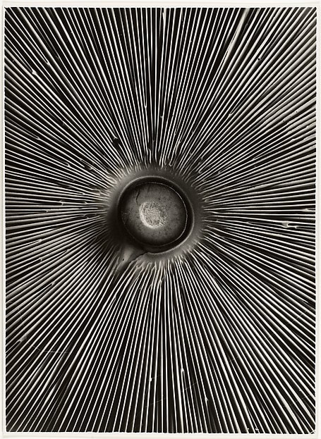
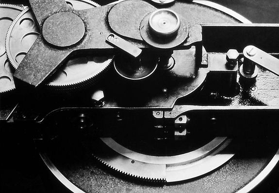
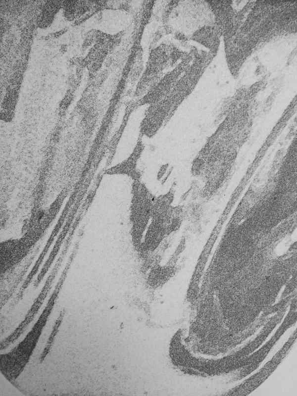
EXAMPLES OF HIS WORK:
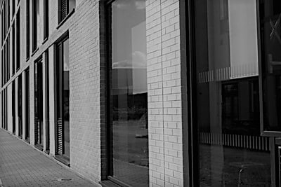
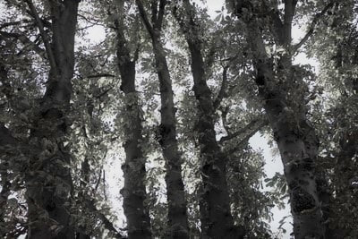
COMPARISON
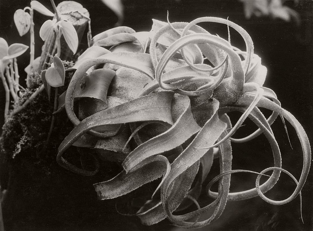
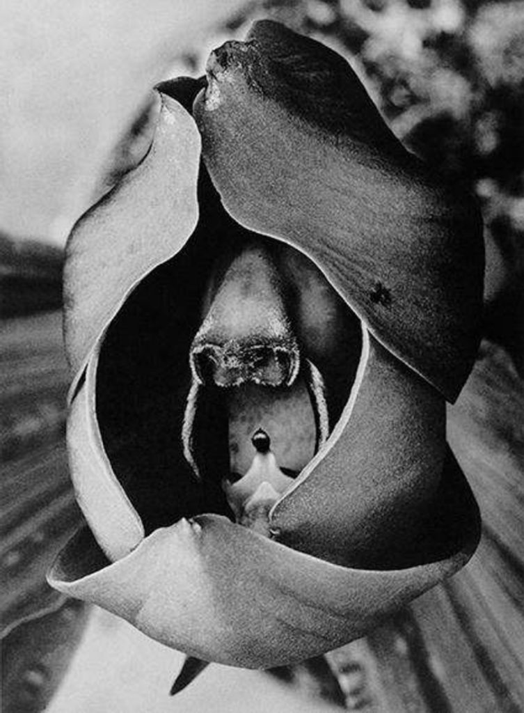
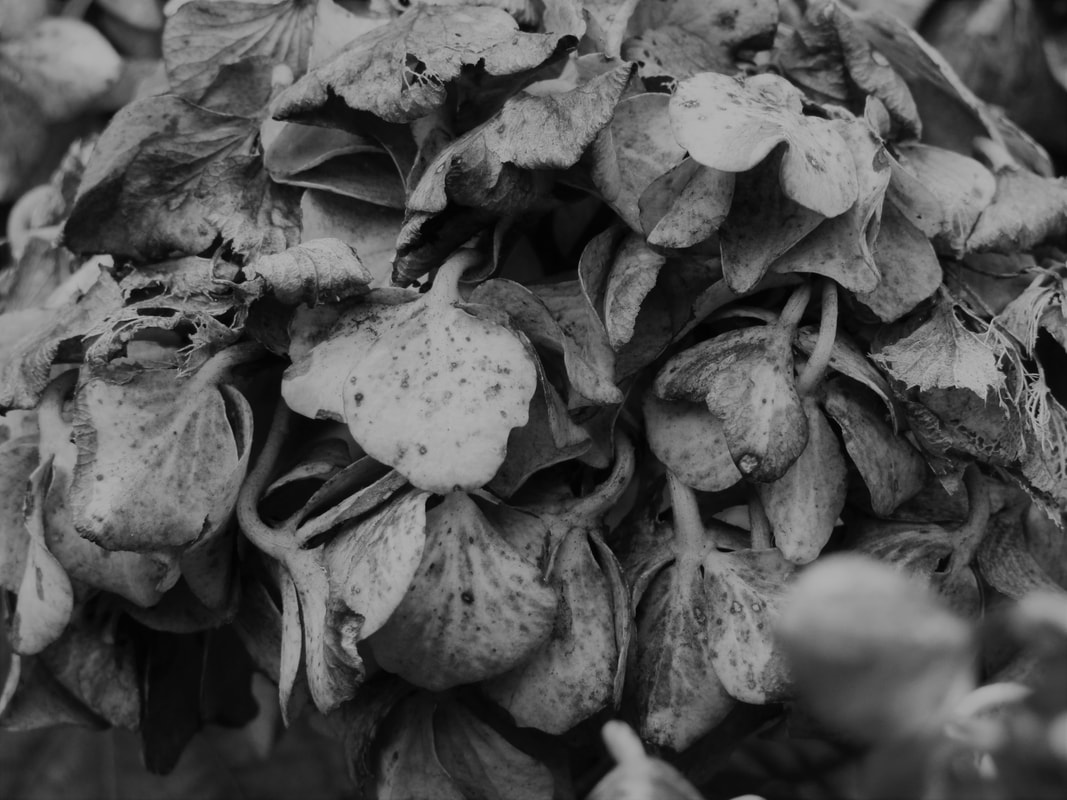
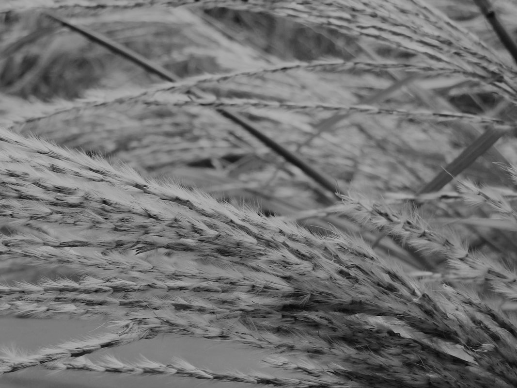
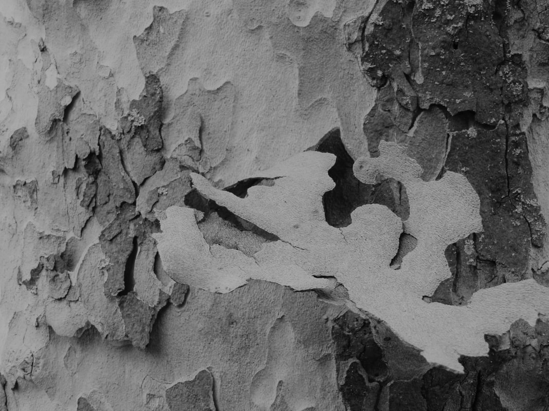
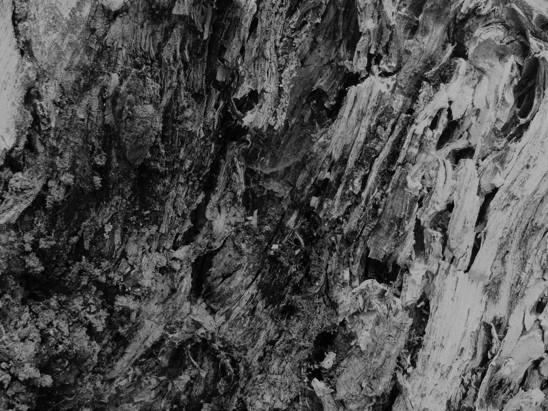
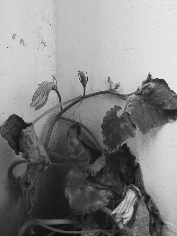
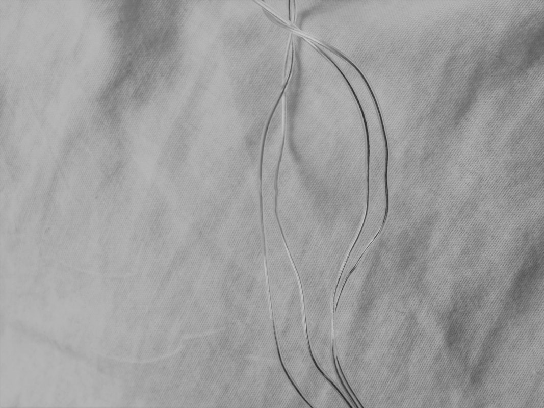
O R G A N I C (Left) :
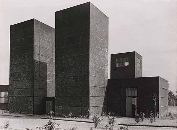
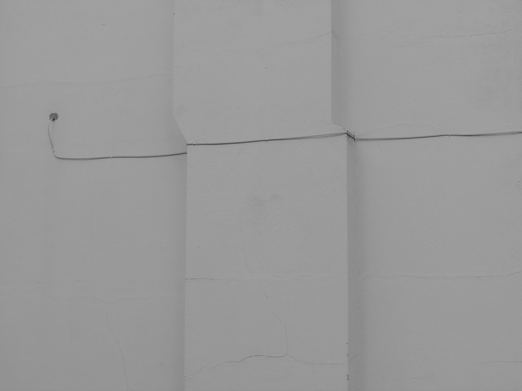
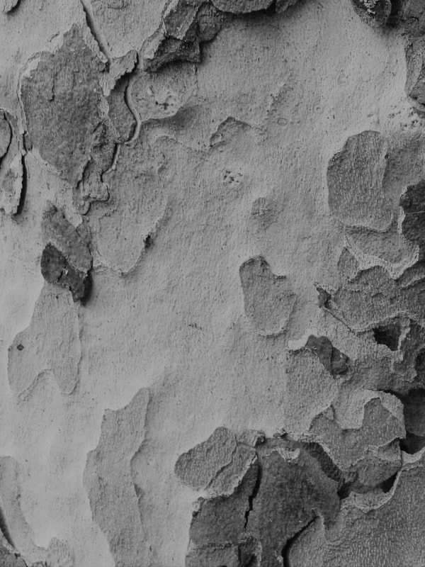
G E O M E T R I C (Right) :
- Up close - you can see lots of details in this image. I like the fact that the plant has been photographed from the side, by doing this Patzsch allows us to see the whole thing, not letting us miss anything. This way, we as viewers, can appreciate and see the beauty in the whole thing, not just one part of it.
- Free flowing. The plant is growing and unchanging. I think you can call this dis-organised, too but there's beauty in that.
- Raw. The way Patzsch has photographed this makes us really see how raw and natural the plant is (up close and capturing it from the side).
- There are lots of patterns and curves in this image, especially the plant's leaves. They seem to curl towards the end. I think the repetition of the curled leaves makes it eye catching and a little chaotic too and by that being the most eye catching part, viewers can really see that there's beauty in chaos.
- You can easily see it has been shot in natural lighting. I think this is the best lighting, especially for nature. We really get to see the plant the way it actually is, any artificial lighting would make it look fake and show us something that isn't real which is opposite to what Patzsch is trying to show us.
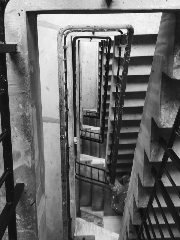
G E O M E T R I C (Right) :
- This image is very straight and angular, it makes it look very clean and satisfying, unlike the plant that's more curvaceous. There's less pattern here, only rectangular and square shapes, where as with the image on the left, there's circular, rectangular and curvy patterns.
- This is stationary unlike the plant where it's continuously growing and changing. This is also more simple than the picture of the plant. There isn't chaos or dis-organisation happening, it's just still and simple.
- This image has been shot in natural lighting too, but the only difference is in this image you can see the shadows the light has cast on the buildings. Shooting from this angle makes the picture more interesting because you get a different perspective of the buildings with the shadows hovering over it.
- The similarities between them is that they're both cropped and framed in a particular way so there's no context in the image, it's just the subject. Patzsch does this because he believes everything should be captured exactly as it is. By doing this, he shows us the true images of the world, the true beauty that everyone in the 20th century forgot about.
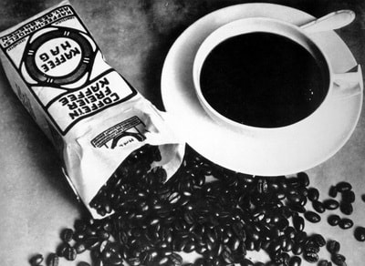
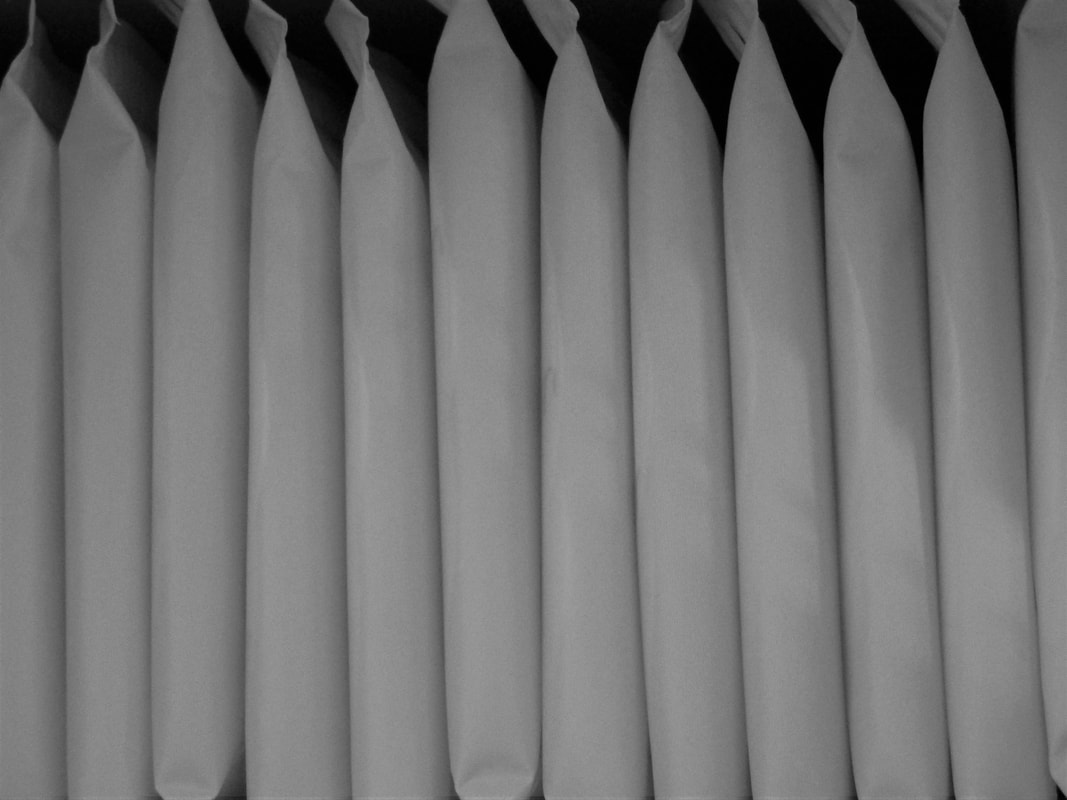
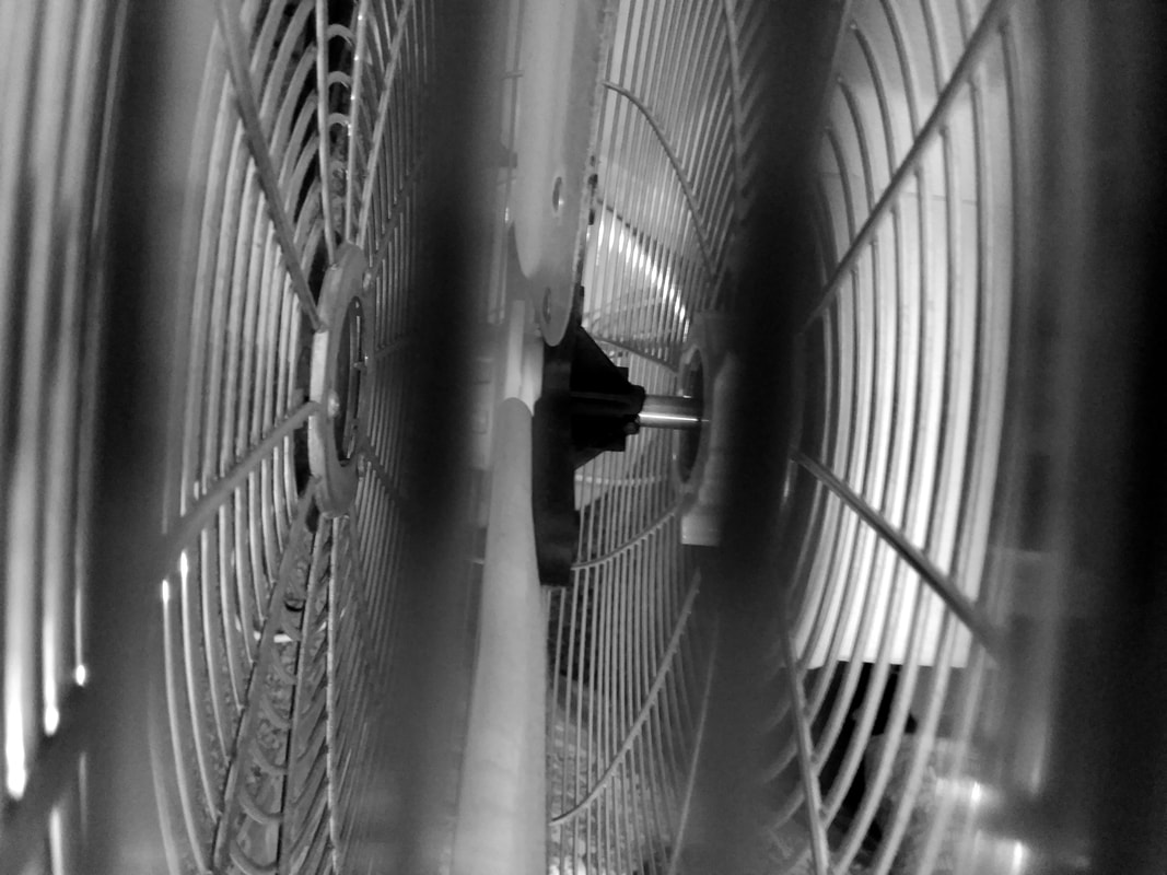
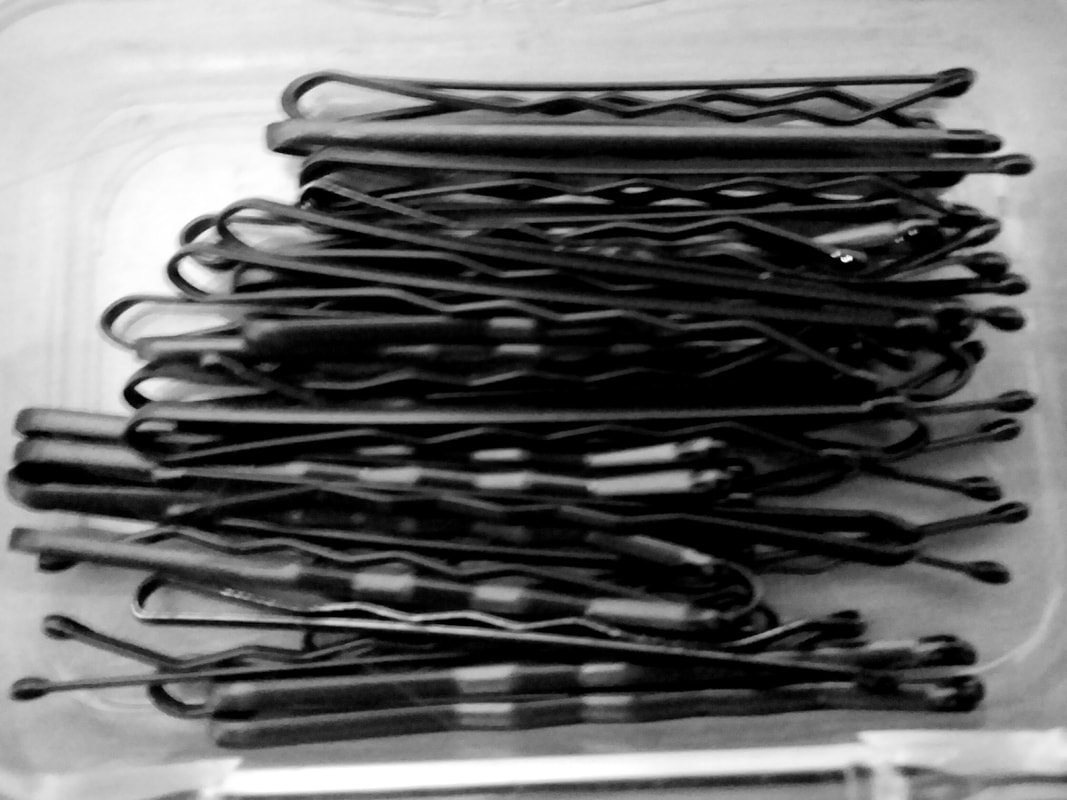
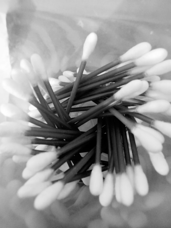
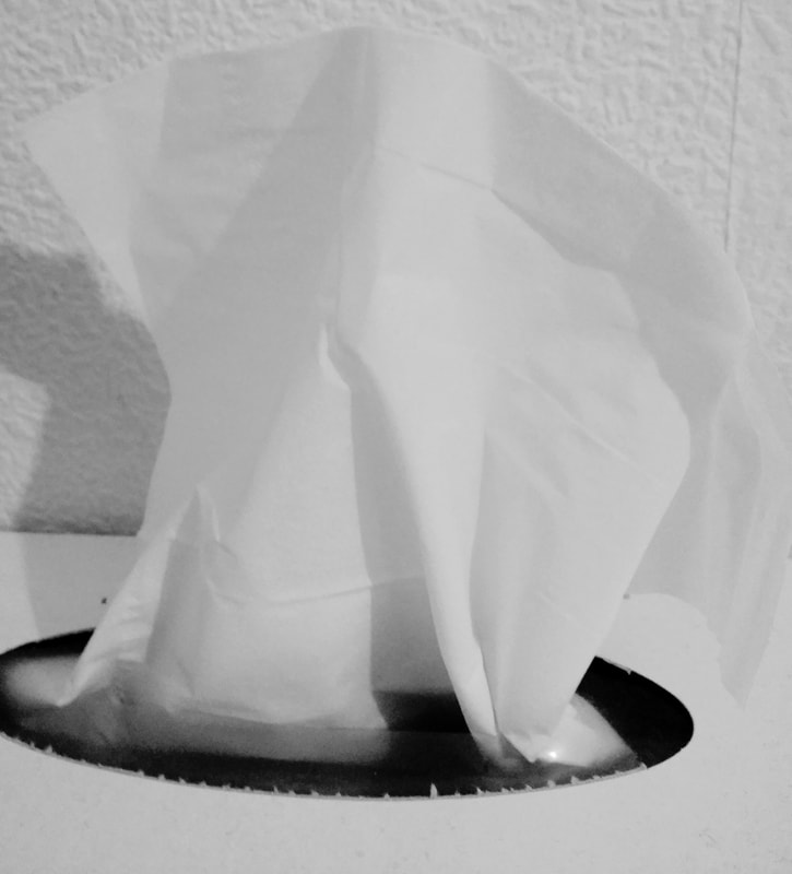
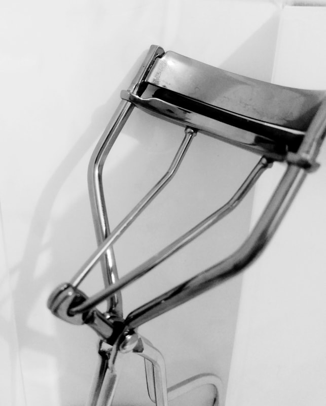
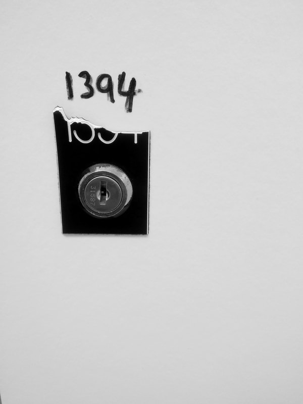
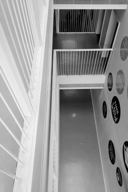
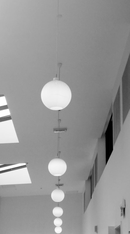
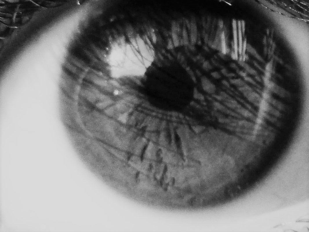
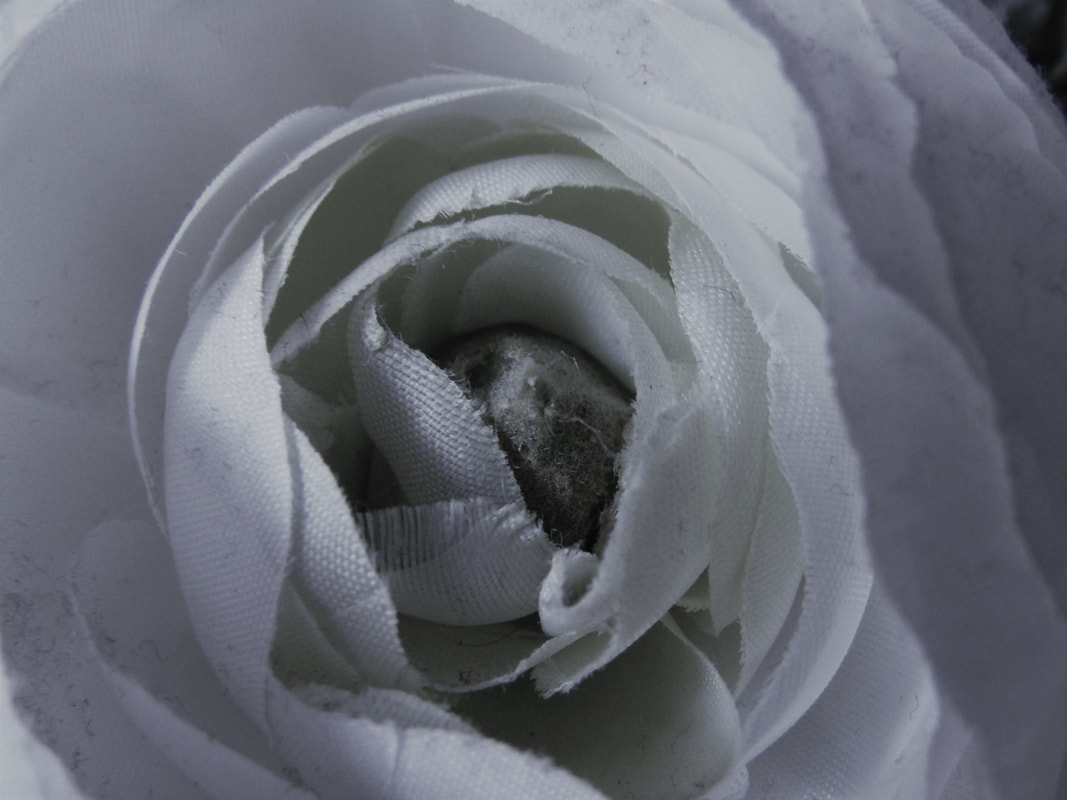
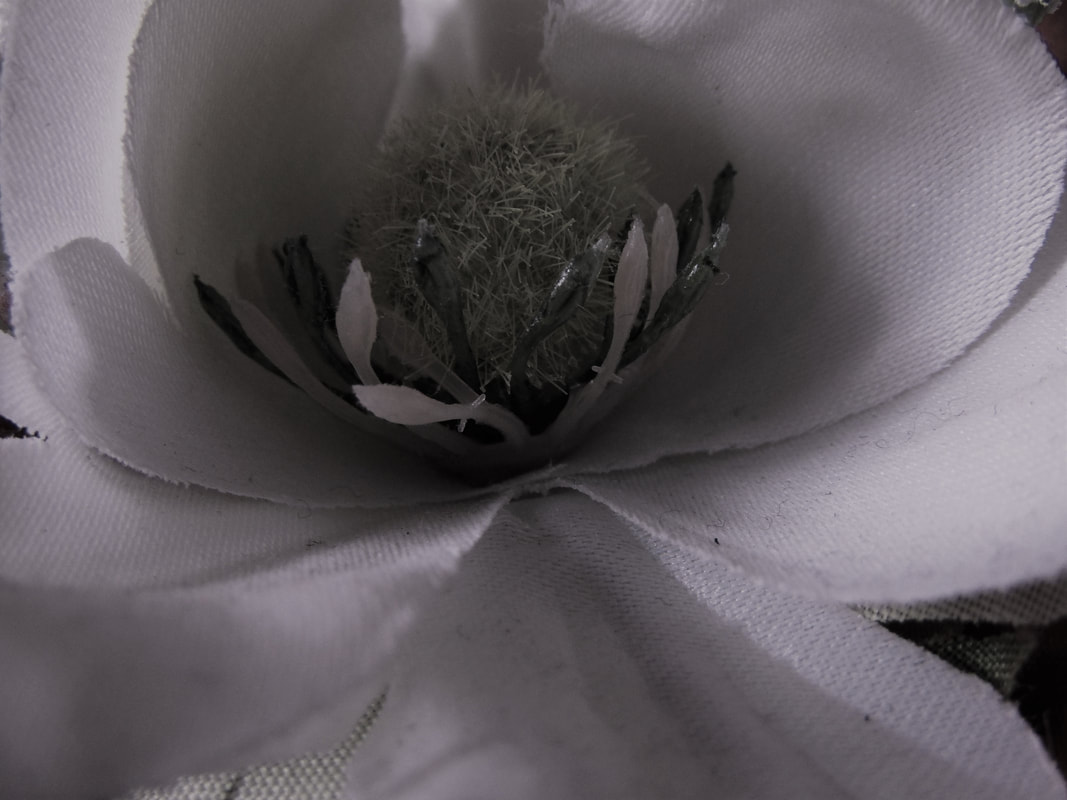
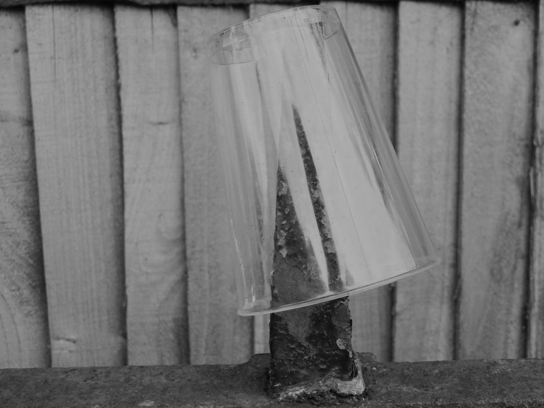
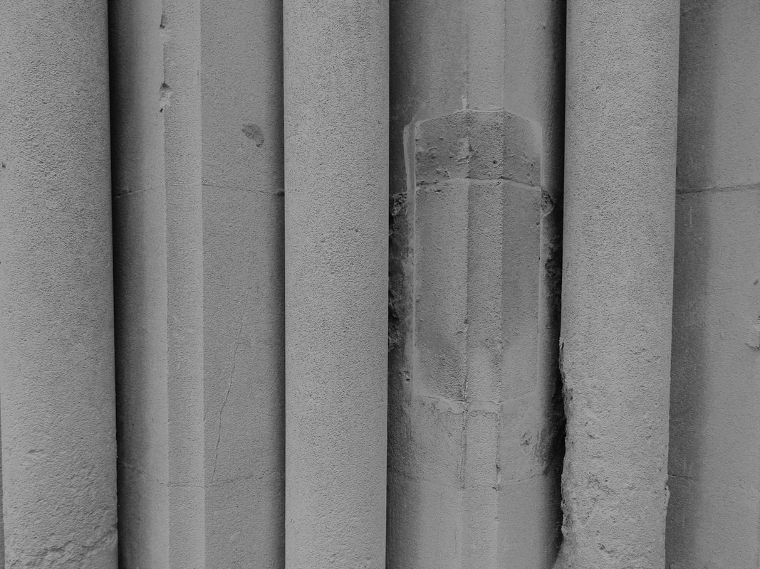
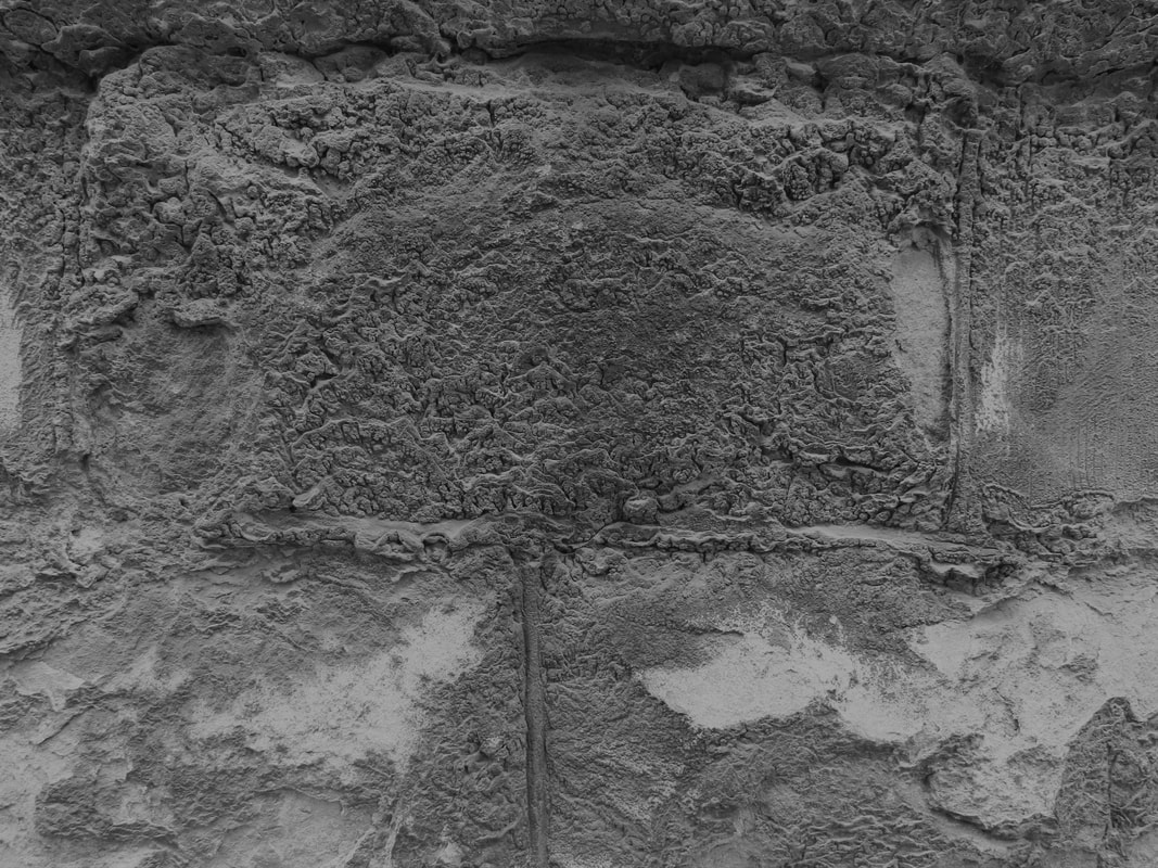
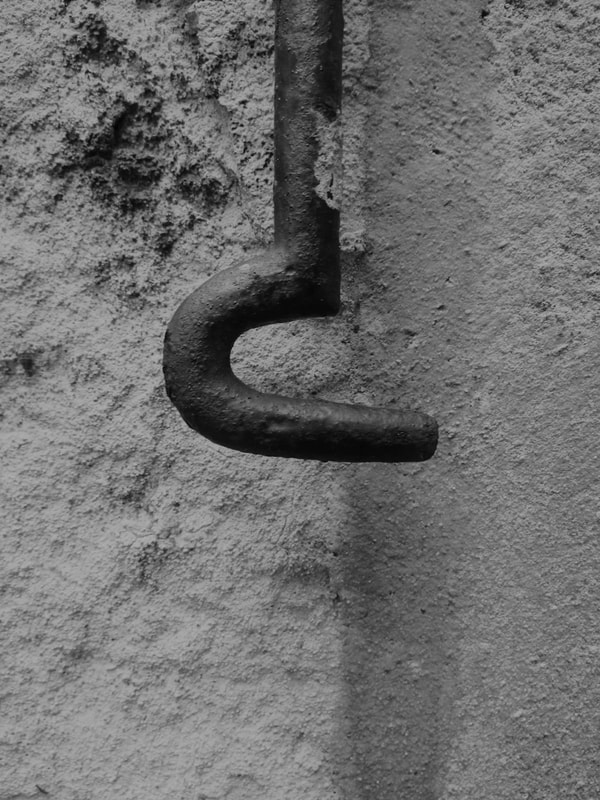
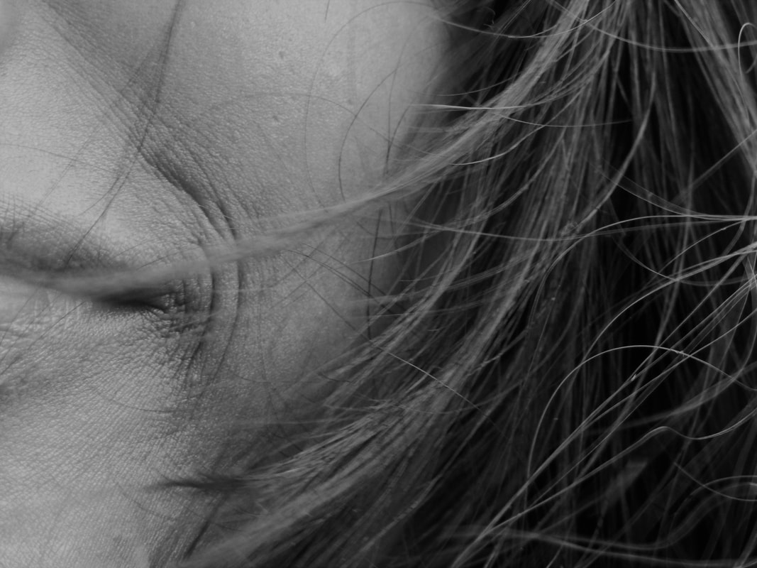
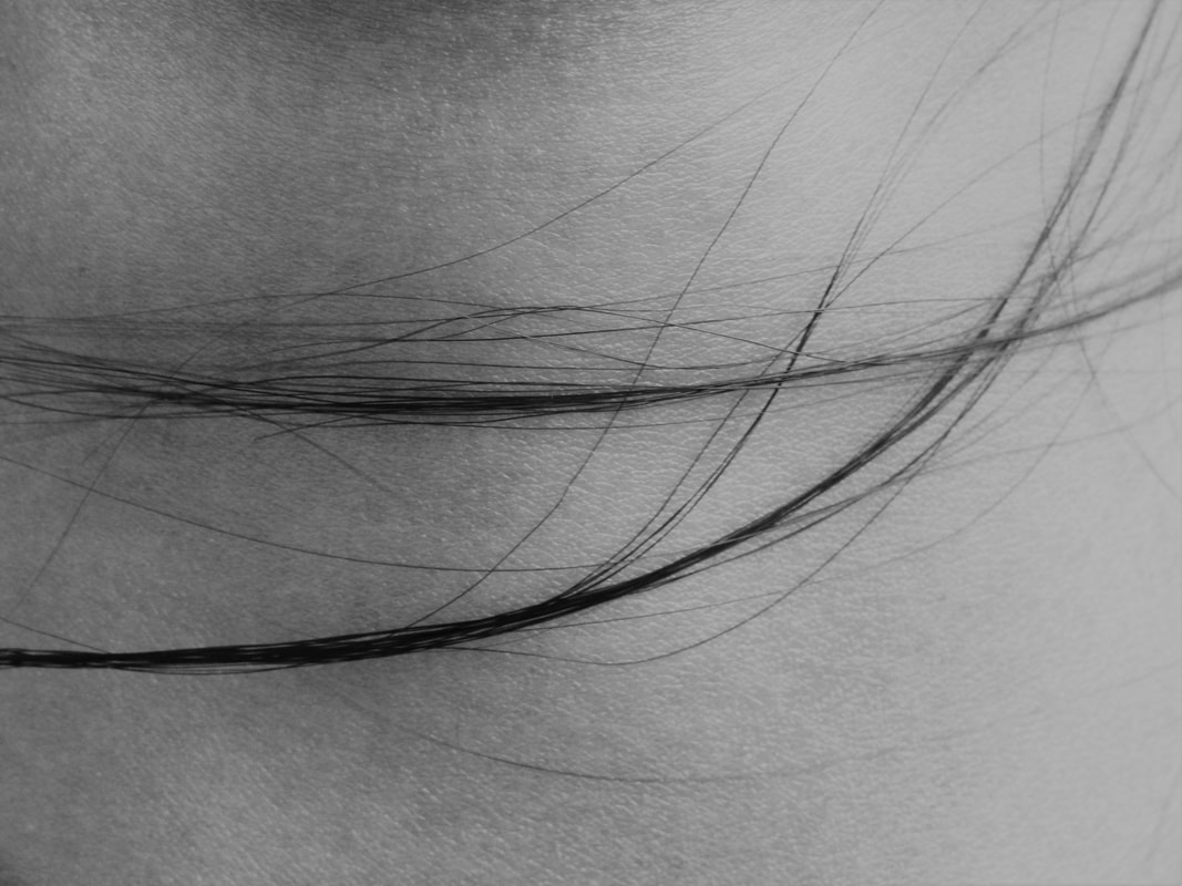
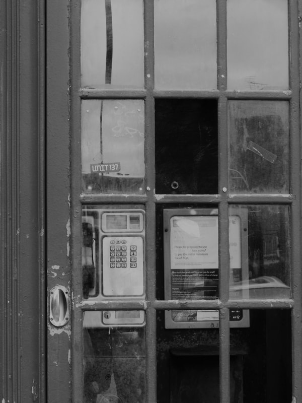
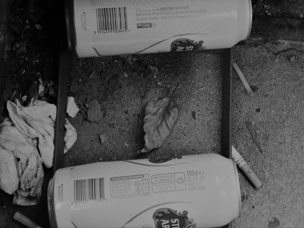
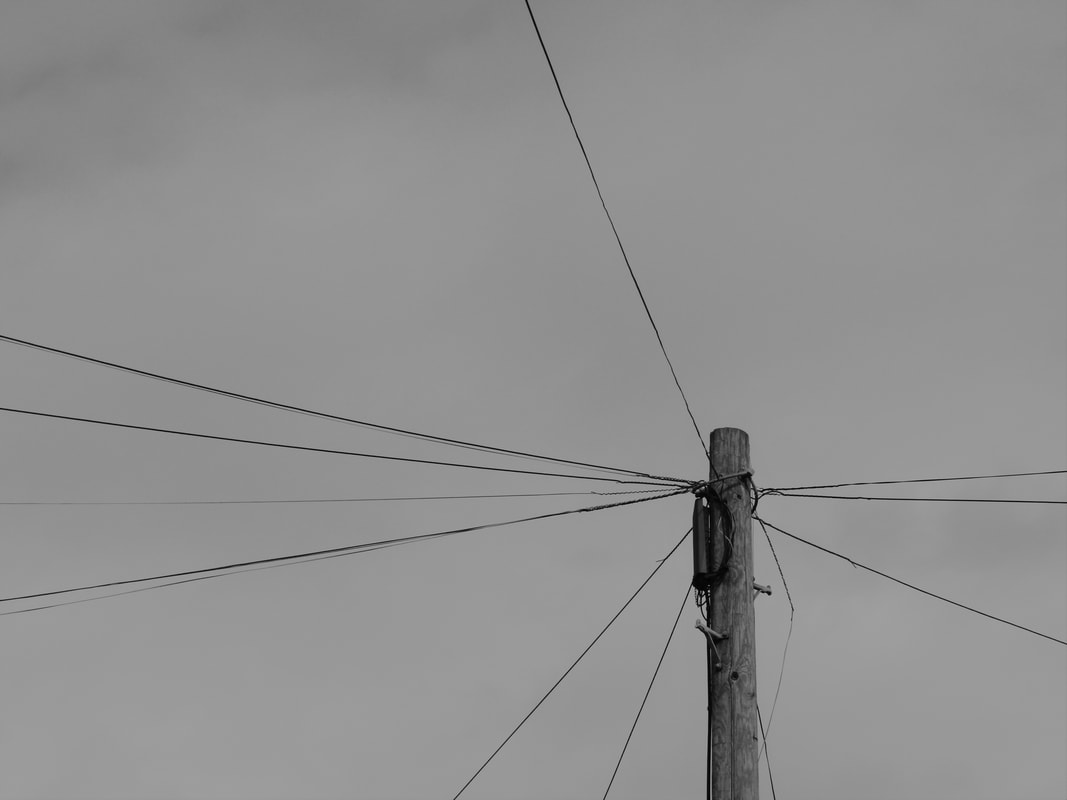
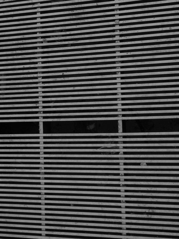
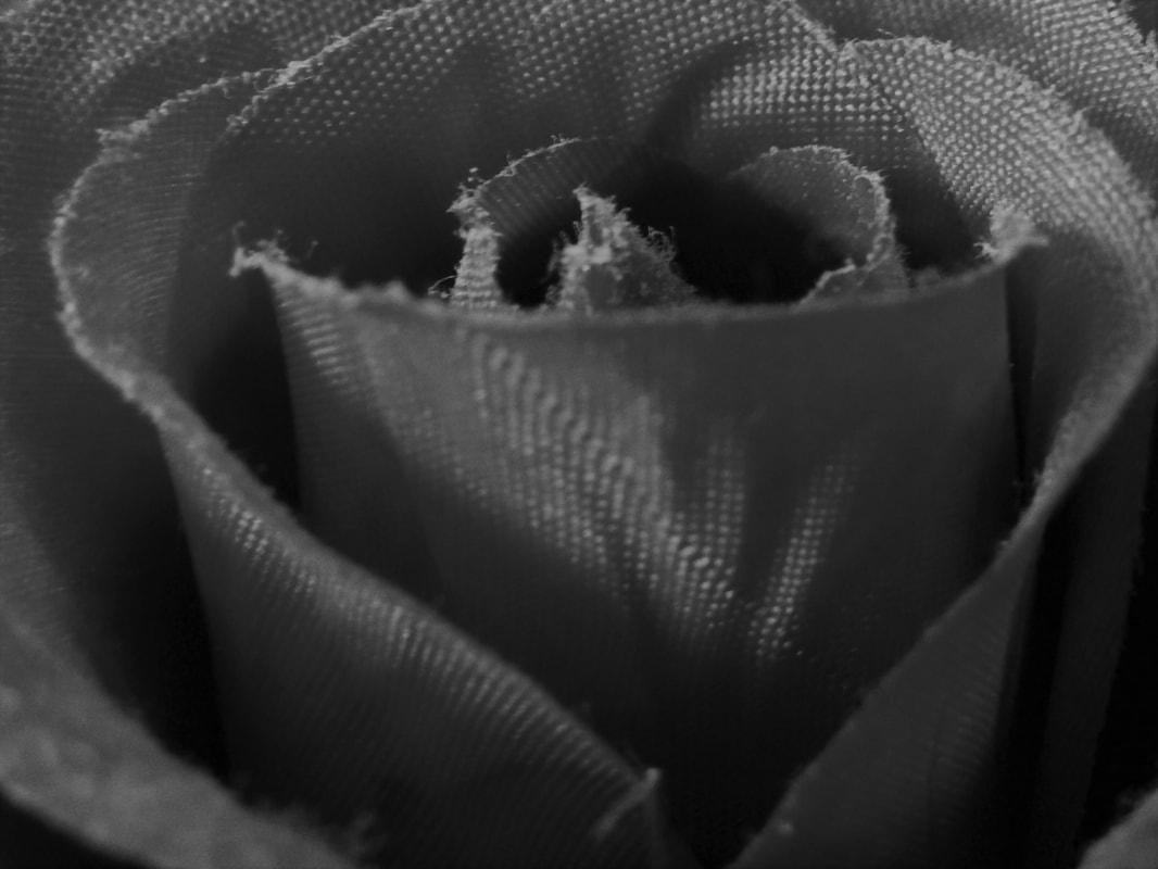
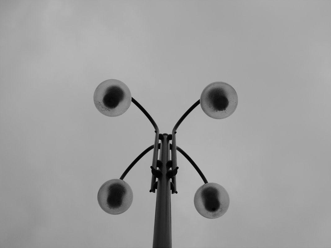
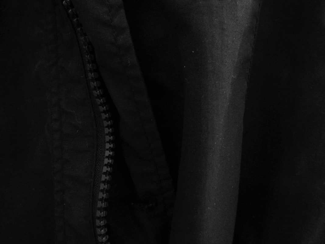
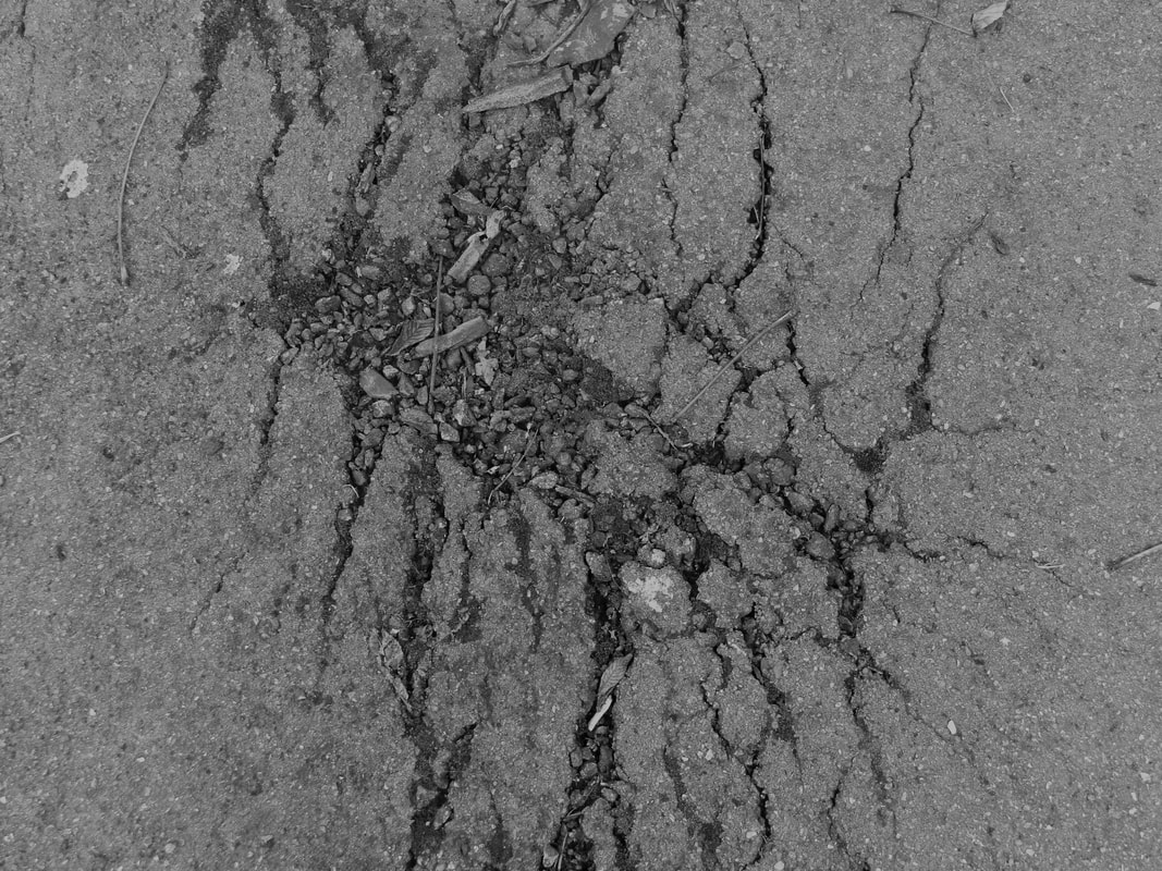
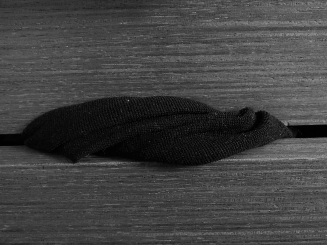
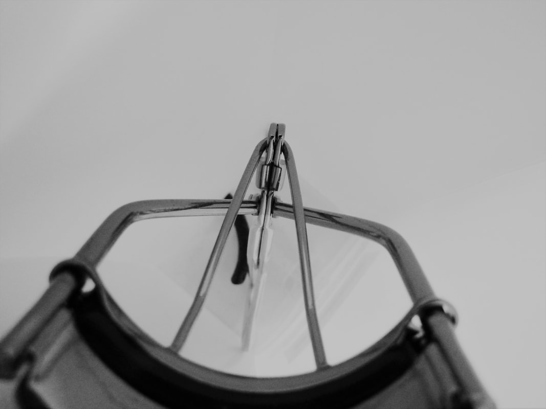
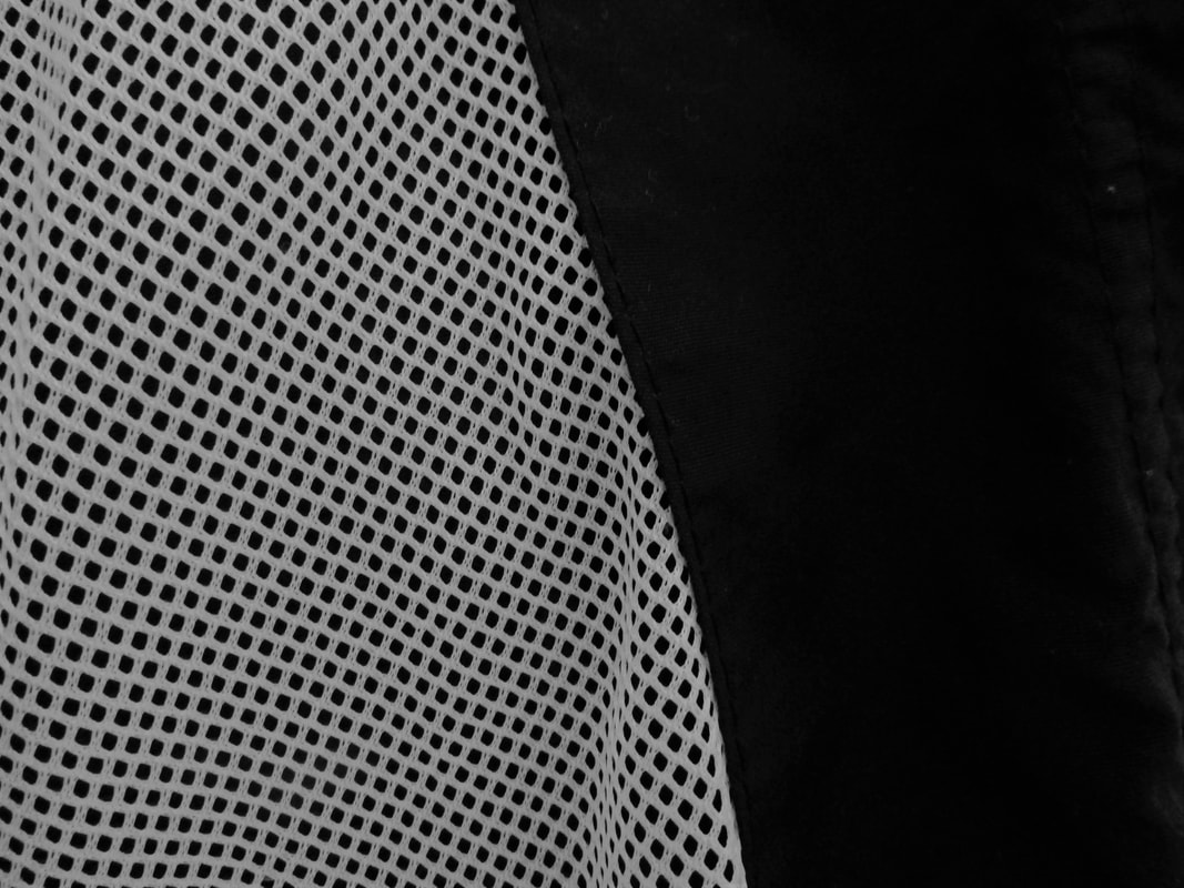
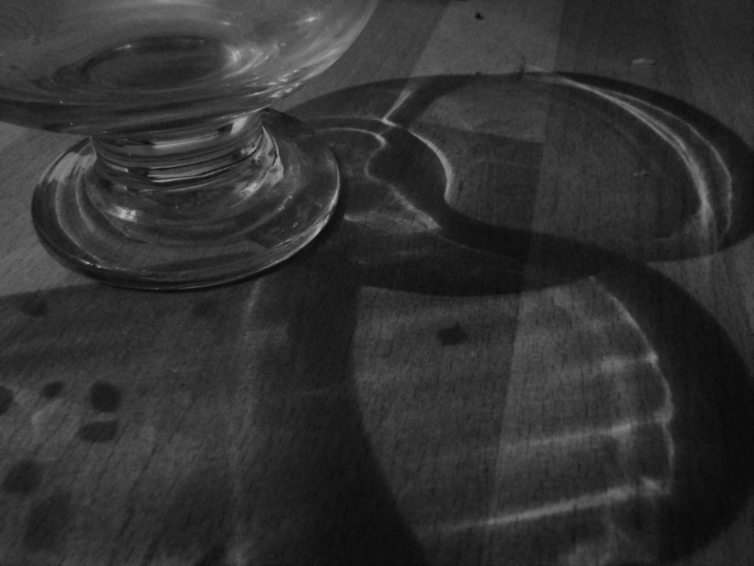
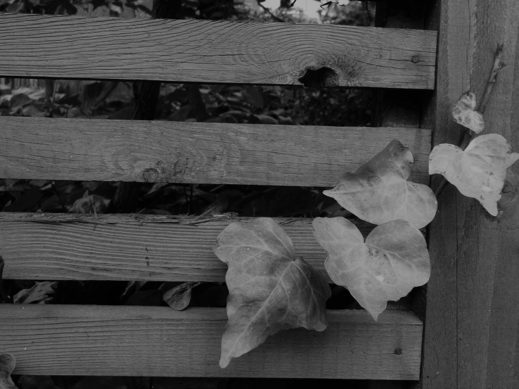
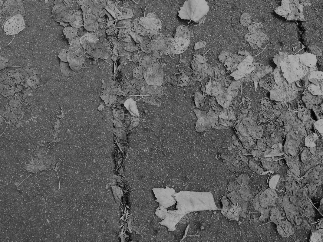
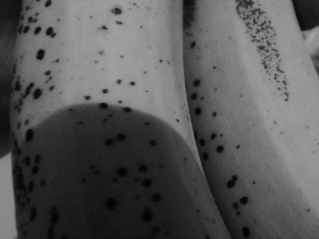
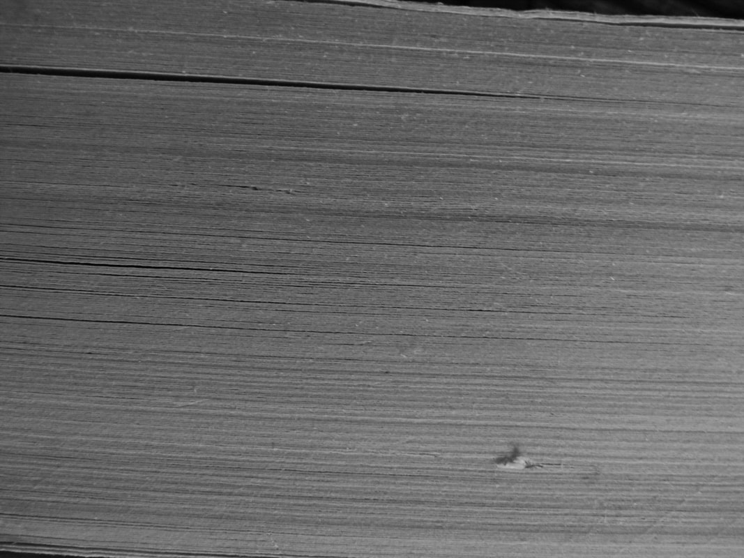
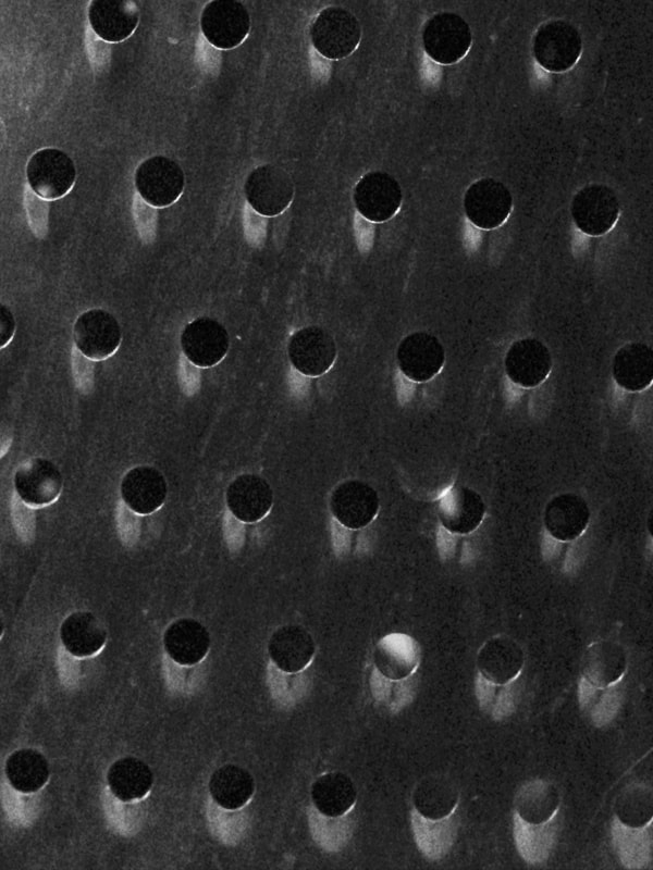
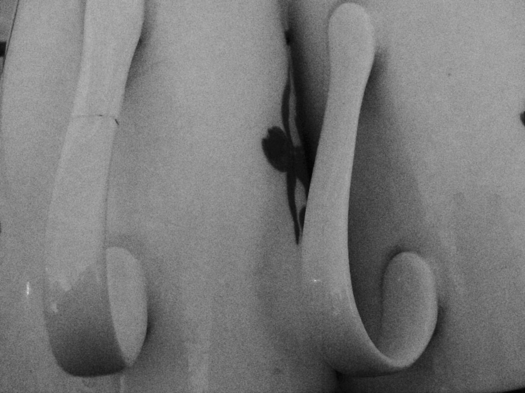
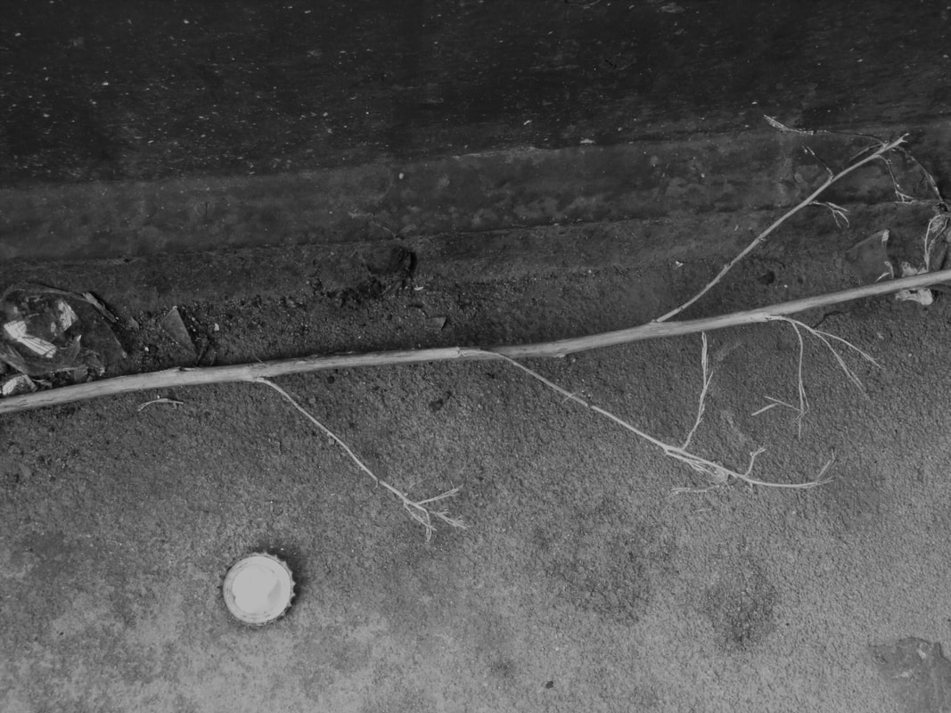
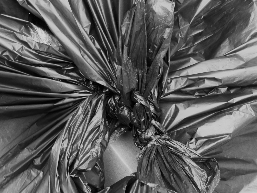
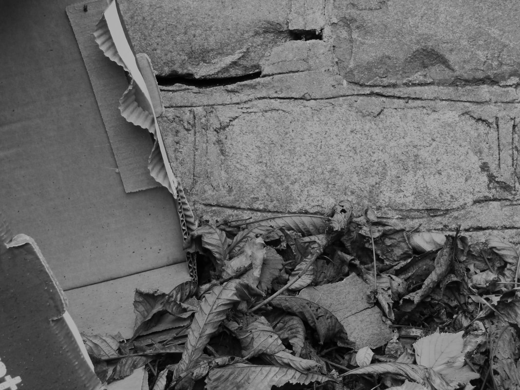
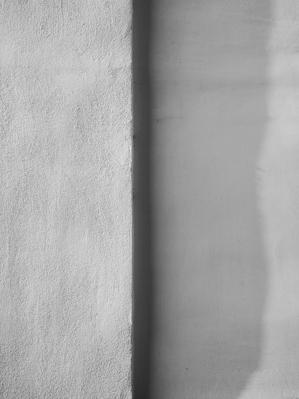
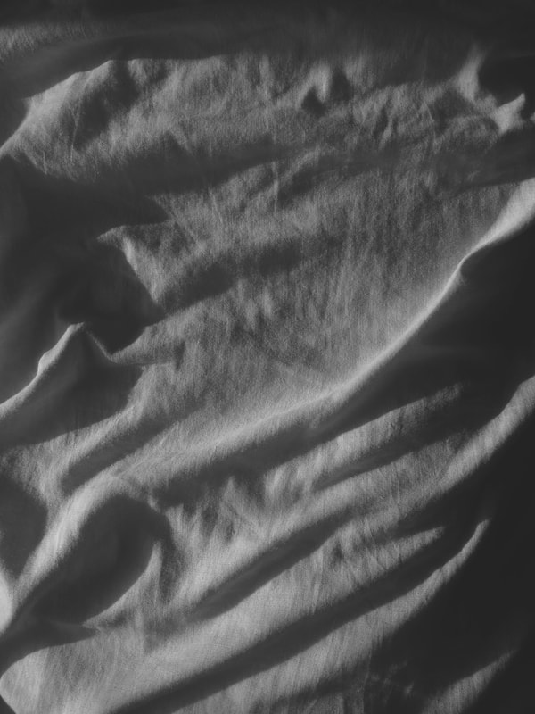
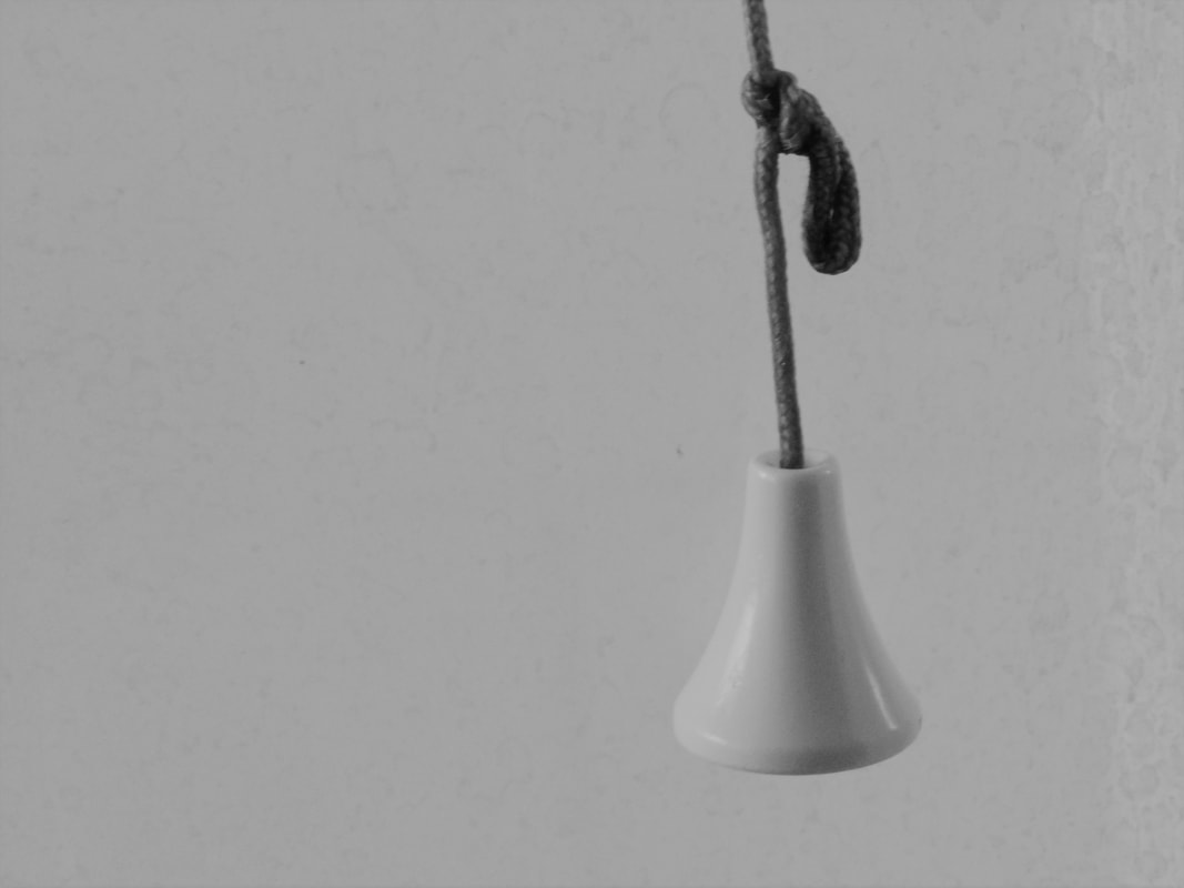
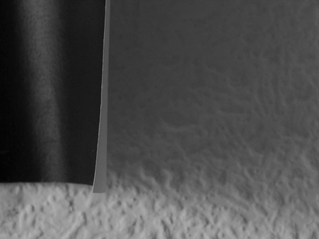
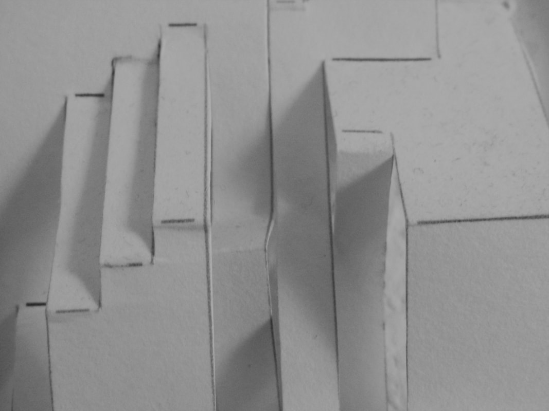
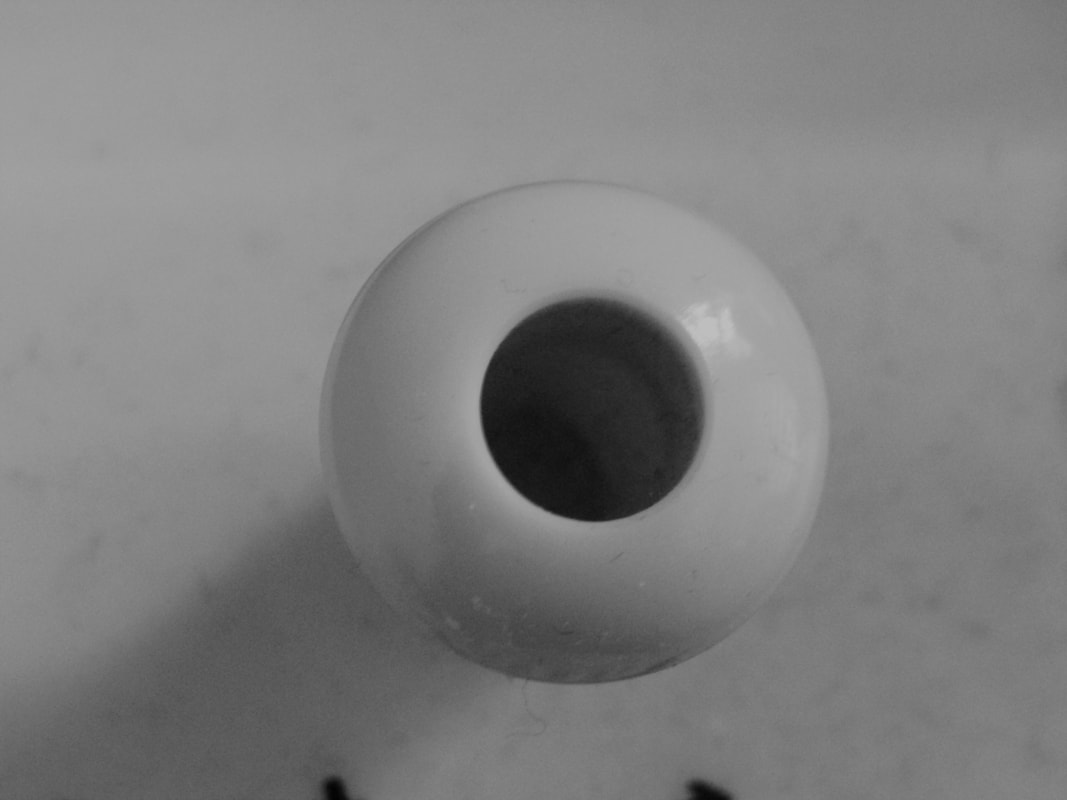
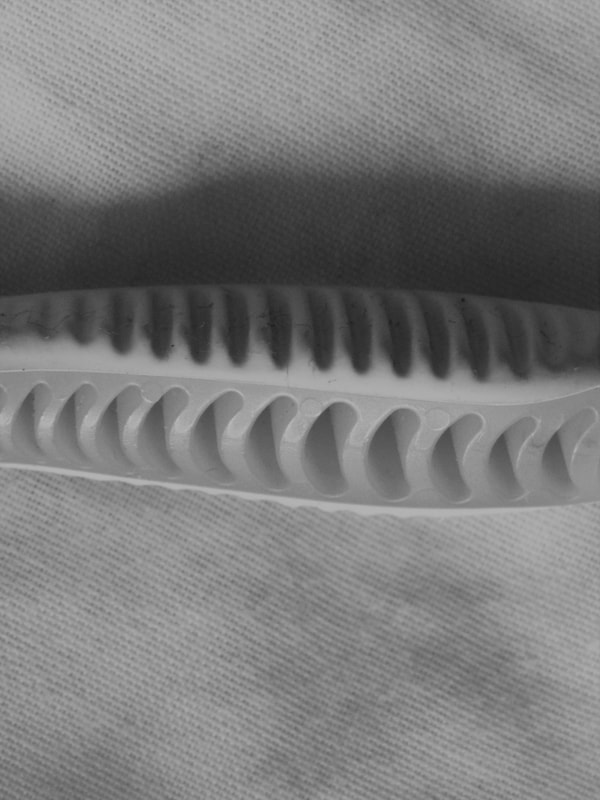
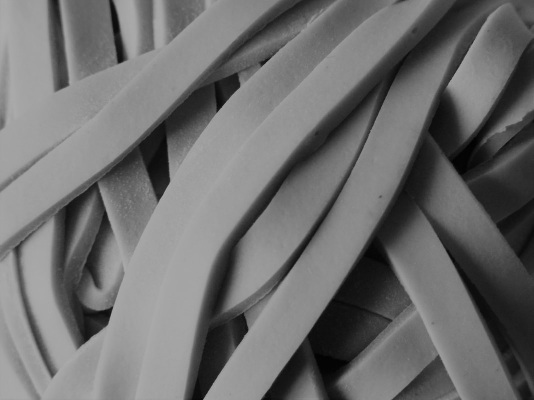
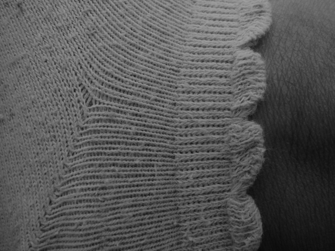
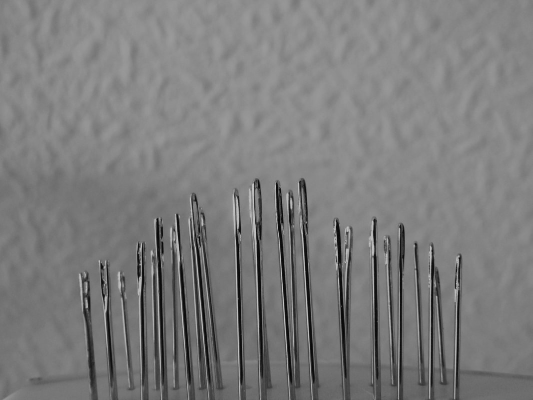
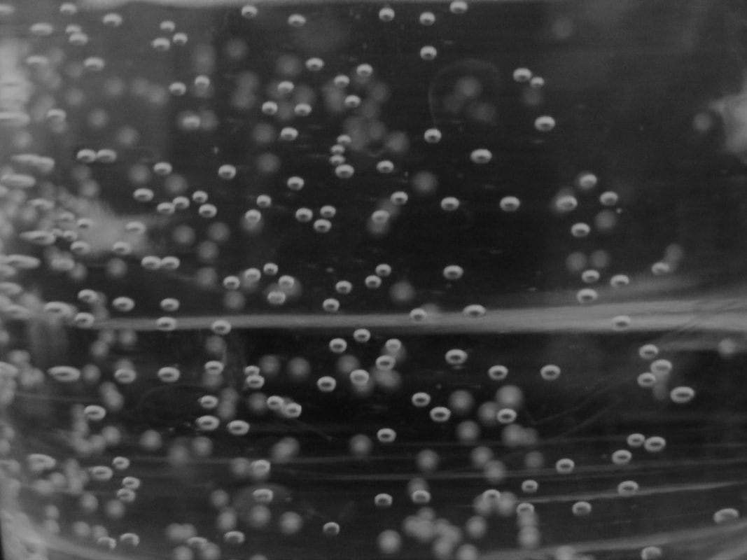
MY RESPONSE - 100 IMAGES:


EVALUATION:
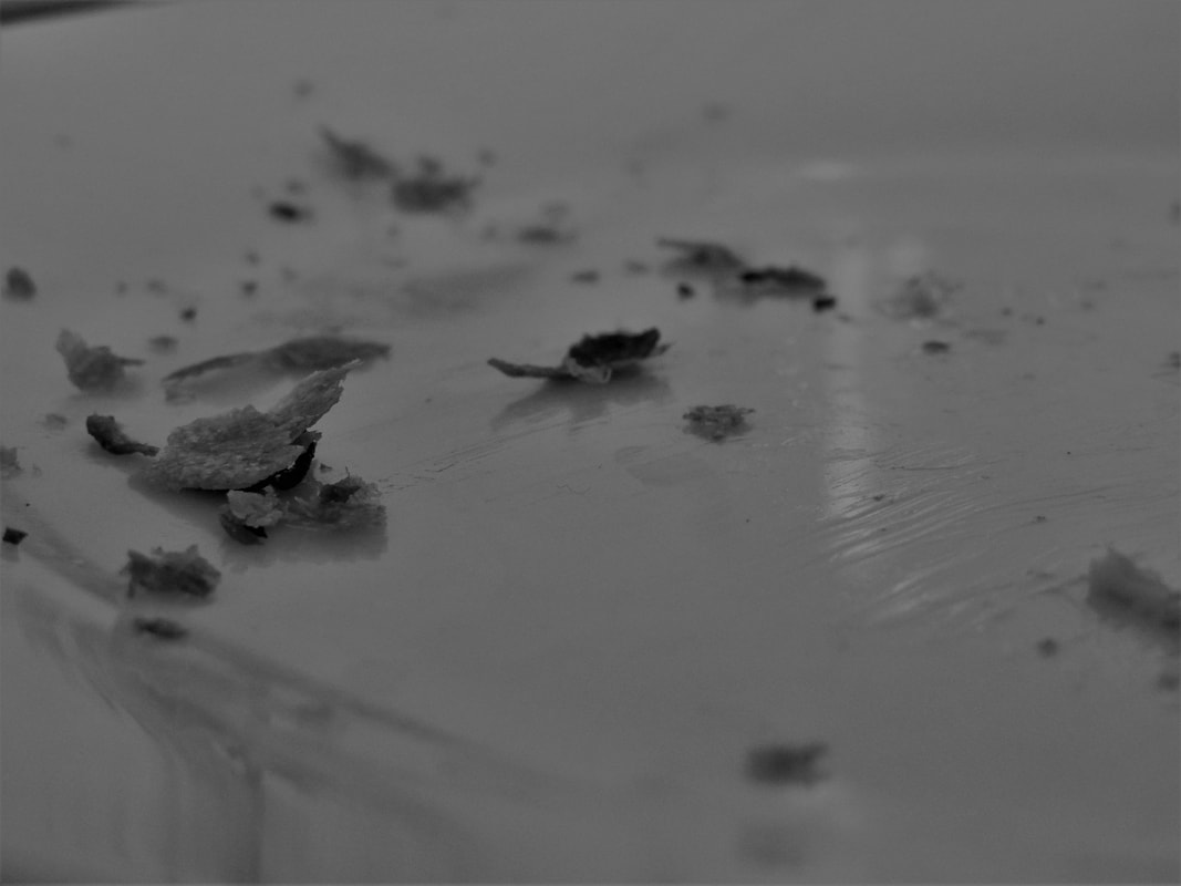
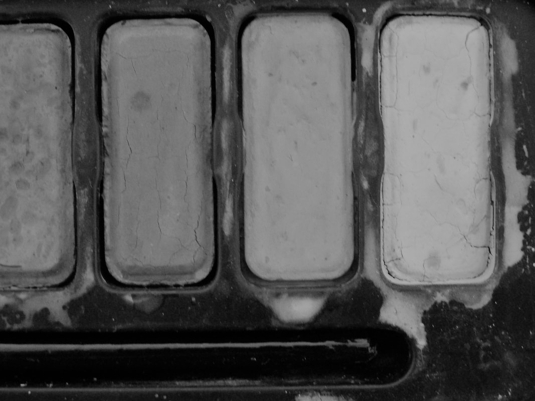
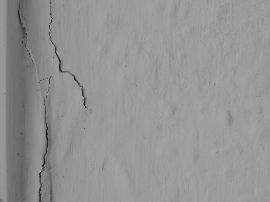
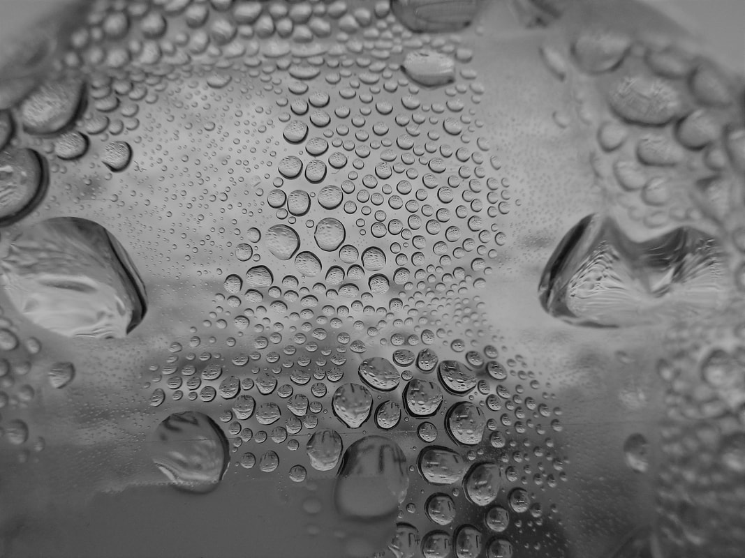
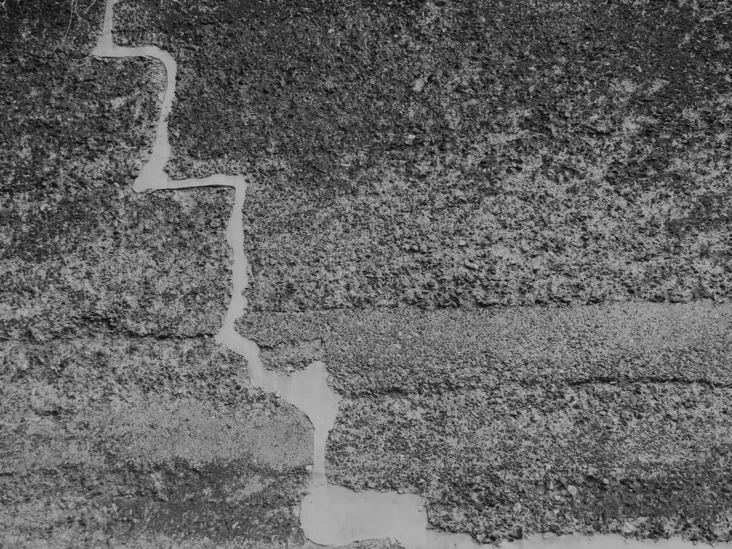
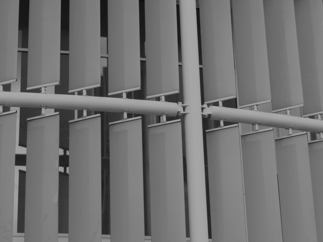
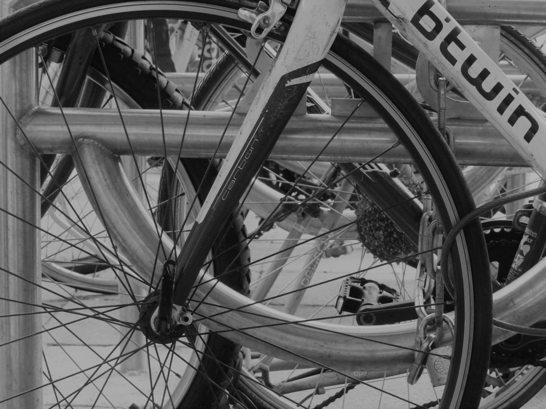
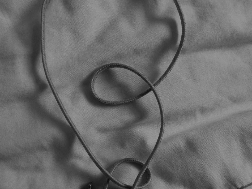
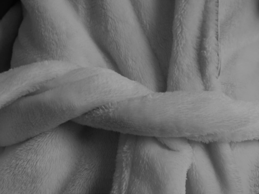
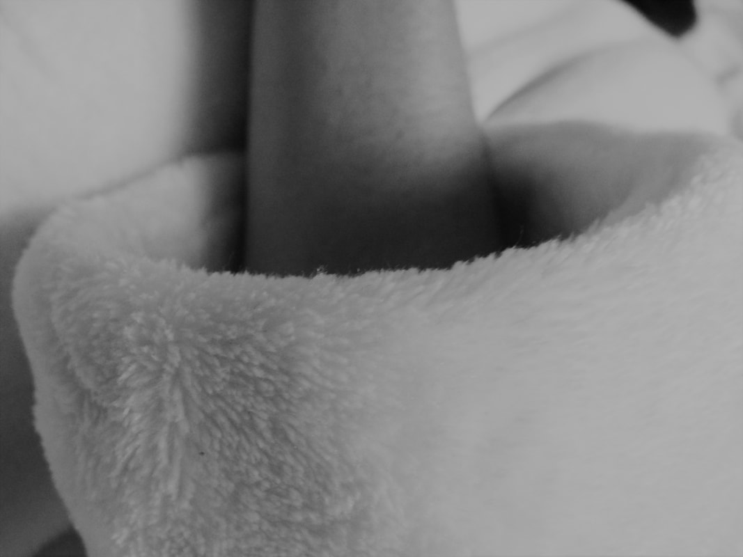
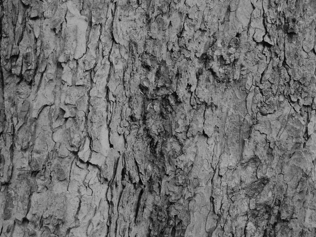
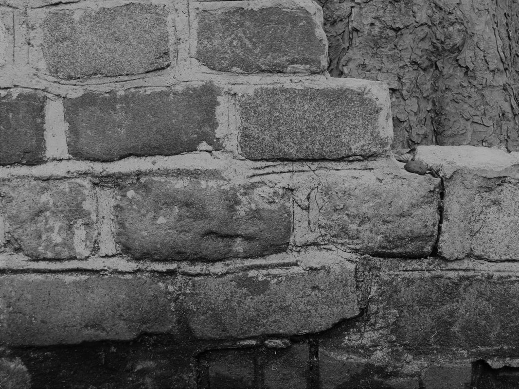
This is my response to Patzsch. I was only able to take a few images at school due to my camera's battery dying (most of the ones I was able to take turned out blurry, so in the end I only had 3 adequate images). I then took some more images at home using my phone and camera. I think taking the pictures at home was better because I was able to really think about what I was taking and I had more time to try images from different angles and be able to experiment. Throughout the whole time, I was thinking of what was interesting about the most mundane things e.g chairs and then took a picture of them. When editing, I wanted to bring out the shapes and lines so you can see the interesting parts to these mundane objects but I didn't change them too much so the image didn't look the original as Patzsch's work is all about taking the picture as it is.When I was editing the images I changed the filter to black and white so the details can be brought out more and I think colours can distract you from seeing the main focus. With a lot of these images, I heightened the contrast so the little details can be brought out more. For a lot of them I decreased the and increased the exposure. For different images, this helped bring out the details and also make the picture look aesthetically pleasing as some of them were too dark or too bright.
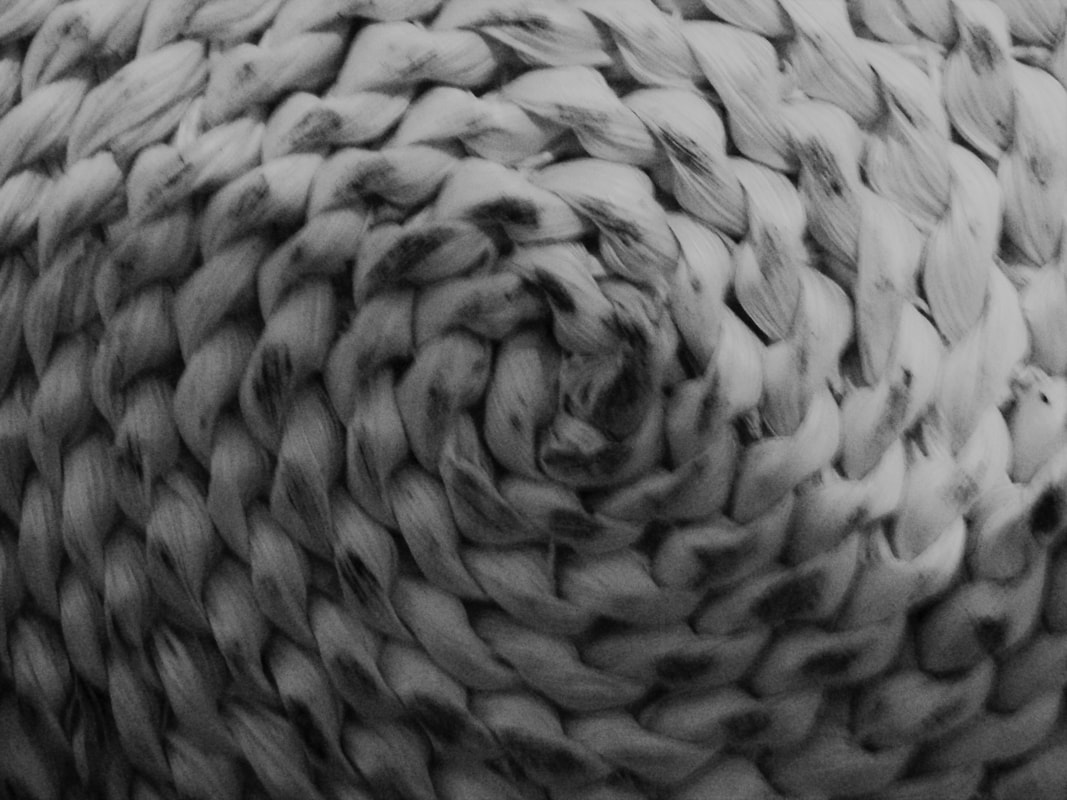
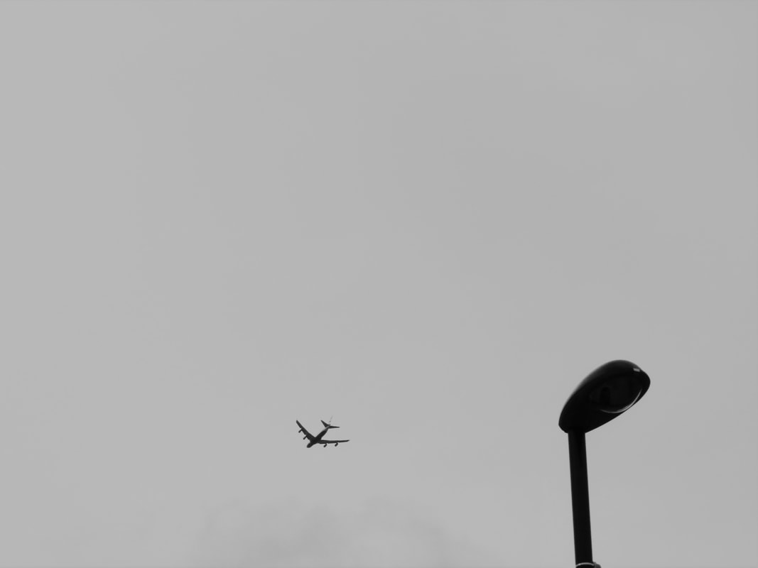
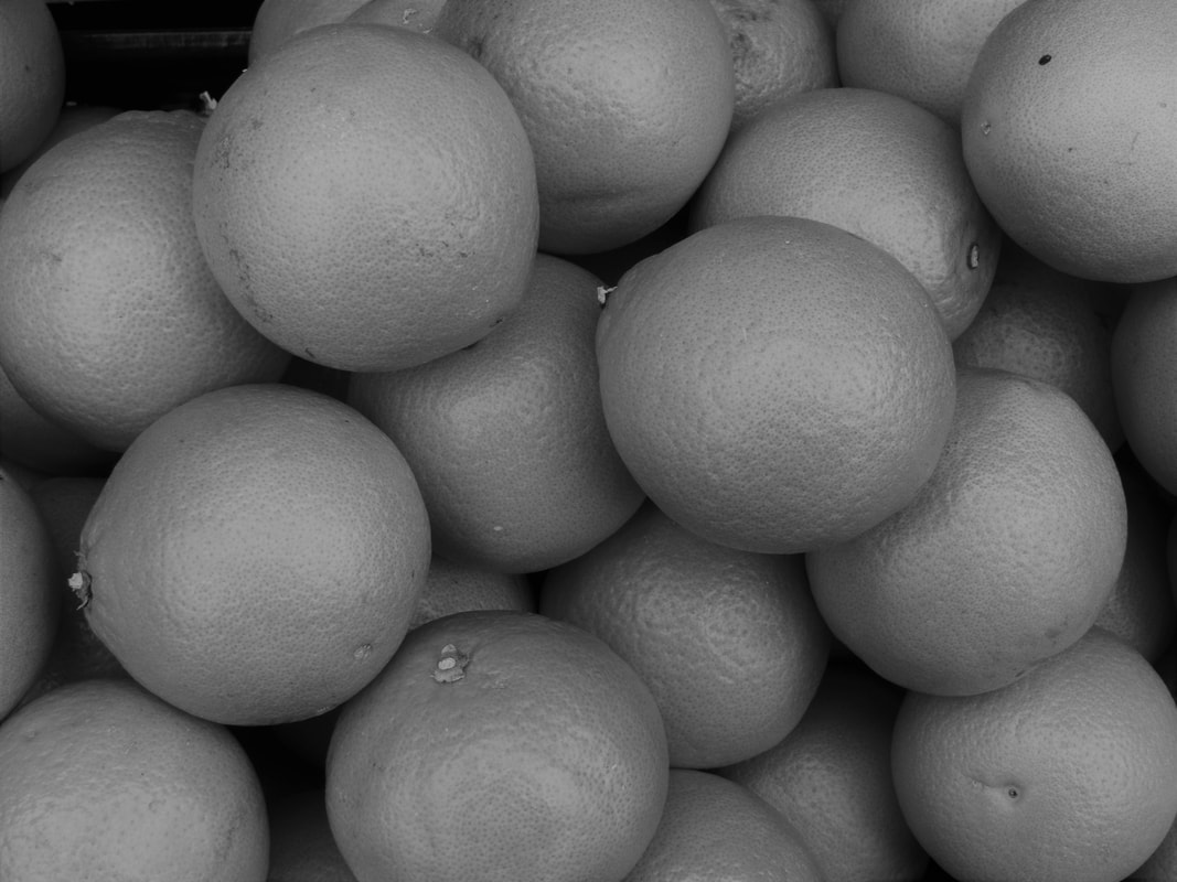
I think my response for Patzsch went quite well. I think I was able to capture the interesting parts of mundane things. For example, in some of the pictures like the stairs and the rolled up piece of paper, there's swirly kind of pattern and there's depth to it. However I think there could be more improvements made to my response to make it more adequate. For example, some of the images are quite grainy and not sharp like Patzsch's work. I think this is because I zoomed in too much or cropped too much of the image. So, next time I will think about how much I zoom in or crop and think about what kind of quality that will make. Also, in Patzsch's work, he has no context in his images, he'd just have the subject. With this image below, the subject isn't focused (the lights), there are other things in the back preventing the lights being the focus and the shapes in the background just doesn't make the image look aesthetically pleasing, it looks a little messy. It doesn't go with Patzsch's idea of taking pictures as they are. I also don't like the picture of the oranges too much, I think the framing isn't like Patzsch's style and it is a very generic image.
I think my response for Patzsch went quite well. I think I was able to capture the interesting parts of mundane things. For example, in some of the pictures like the stairs and the rolled up piece of paper, there's swirly kind of pattern and there's depth to it. However I think there could be more improvements made to my response to make it more adequate. For example, some of the images are quite grainy and not sharp like Patzsch's work. I think this is because I zoomed in too much or cropped too much of the image. So, next time I will think about how much I zoom in or crop and think about what kind of quality that will make. Also, in Patzsch's work, he has no context in his images, he'd just have the subject. With this image below, the subject isn't focused (the lights), there are other things in the back preventing the lights being the focus and the shapes in the background just doesn't make the image look aesthetically pleasing, it looks a little messy. It doesn't go with Patzsch's idea of taking pictures as they are. I also don't like the picture of the oranges too much, I think the framing isn't like Patzsch's style and it is a very generic image.
